Always on every piece
- Our mark in its place: the badge logo, or the name lettering for STRNGTH., STRENGTH Collective and STRENGTH Showdown, used as the file is (Logo, When to use what). People learn a mark only when it shows up the same way every time.
- The red heart pin: it ends the main headline on main look, STRNGTH. and oneSTRNGTH. pieces, and the name lettering on STRENGTH Collective and STRENGTH Showdown pieces, where the period would be (Logo, The pin at the end of a headline). It is the one shape every STRENGTH brand shares.
- Our colors lead: the look's own colors carry the piece; photos bring their own colors (Color); a STRNGTH. piece always shows its seven colors, even as a small touch (Brand Board, STRNGTH. and oneSTRNGTH., Colors). Red, black and warm white are what people already know us by.
- The Poppins headline voice: headlines in Poppins ExtraBold, big and plain, with the Collective serif and the Rebels Archivo as their set exceptions (Type, Which font, when).
- Real people from our own events, cleared (Photos). We create the space where communities meet, so the photos show that space and the crew in it.
Rebels for a Cause keeps its own set look: its own badge, no pin, Archivo (Brand Board, Rebels for a Cause).
Yours to play with
- The idea: a theme or a series concept, such as a "Now Boarding" airline series for the tour, a candle-lit Unplugged night, or "by the numbers".
- Texture: crumpled paper, grain, film, paint, halftone.
- Photo treatment: color, black and white, a warm film look, low light. People should still look like themselves.
- Layout: where things sit, alignment, how many slides, how big the headline runs, and whether it is in capitals or sentence case.
- Collage, cut-outs, illustration, maps, shapes such as circles behind letters.
- Script words in the look's script (Type, Which font, when), as many words and slides as the piece wants. Dates, prices, places and names stay plain, so nobody misreads them.
- Supporting words in another font for a series idea, as long as the font is free to use everywhere (Type, Fonts and where to get them) and the headline stays in Poppins.
Not play: a new color set, a redrawn or recolored logo or pin, another font for a name or a headline.
The test
Cover the logo. Does it still feel like STRENGTH? If yes, it is on brand. If not, add back what is missing from the five above.
What are you making?
Find your piece. Each card holds only the numbers: size, margins, the space to keep clear, the logo and its size, type sizes and the files. The style is yours.
Square or portrait post
- Size
- 1080 x 1080 px or 1080 x 1350 px
- Margin
- 80 px (10 U)
- Keep clear
- Margins only
- Logo
- The main Red badge logo, city events too, or on our own account a main look headline that ends in the pin. Size: 144 px.
- Type
- Headline 152 px or 85 px, text 36 px, small 27 px
- The five on every piece are there (Always on every piece)?
- Every name, date and price written the one way (Words)?
Carousel
- Size
- 1080 x 1350 px, every slide the same
- Margin
- 80 px (10 U)
- Keep clear
- Margins only
- Logo
- The badge logo on the first or the last slide, or a headline that ends in the pin. The last slide may end on the pin. Size: 144 px.
- Type
- Headline 152 px or 85 px, text 36 px, small 27 px
- The five on every piece are there, across the slides (Always on every piece)?
Story or reel
- Size
- 1080 x 1920 px
- Margin
- 80 px at the sides
- Keep clear
- Top 250 px, bottom 320 px. Headline inside the middle 1080 x 1350
- Logo
- The logo, the pin or our name in the first 3 seconds. A video may end on the pin. Size: 144 px.
- Type
- Headline 152 px or 85 px, text 36 px, small 27 px
- Nothing people must read in the top 250 px or the bottom 320 px?
- Our mark in the first 3 seconds?
Downloadsitc-badge-logo.svgsitc-icon-pin-for-dark-backgrounds.svg
Flyer
- Size
- 8.5 x 11 in
- Margin
- 5/8 in (5 U)
- Keep clear
- Plus 1/8 in bleed
- Logo
- The main Red badge logo, city events too, or the name lettering of a STRNGTH., STRENGTH Collective or STRENGTH Showdown piece; a flyer travels without us, so never the pin alone. Size: 1 1/8 in.
- Type
- Headline 51 pt or 28 pt, text 12 pt, small 9 pt
Poster
- Size
- 18 x 24 in
- Margin
- 1 3/8 in (11 U)
- Keep clear
- Plus 1/8 in bleed
- Logo
- The main Red badge logo, city events too, or the name lettering as the headline; never the pin alone. Size: 2 3/8 in.
- Type
- Headline 118 pt or 66 pt, text 28 pt, small 21 pt
- Built at its own size, not a flyer blown up?
- 1/8 in bleed, words inside the margins?
- Sponsor logos smaller than ours (Partners)?
Downloadsitc-badge-logo.svgstrength-in-the-city-name-black.svg
Deck
- Size
- 1920 x 1080 px
- Margin
- 80 px (10 U)
- Keep clear
- Margins only
- Logo
- The badge logo on the cover and on the last slide, no logo on the slides between. Size: Badge logo 144 px on the cover and the last slide.
- Type
- Headline 118 px or 66 px, text 28 px, small 21 px
- Every price and date real, nothing made up?
- Partner logos smaller than ours, no words in front of our name (Partners)?
Downloadsitc-badge-logo.svg
Email or newsletter
- Size
- 600 px wide, one column
- Margin
- 24 px at the sides
- Keep clear
- Margins only
- Logo
- The badge logo at the top and in the email signature; the header logo only where the badge does not look good or does not fit. Size: Badge logo, 110 px (header logo, 38 px tall, where the badge does not look good or does not fit).
- Type
- Headline 40 px or 28 px, text 16 px, small 13 px
- Every word that matters is real text, not only inside a picture?
- Dates, times and prices written the one way (Words)?
Downloadsitc-badge-logo.pngsitc-header-logo-for-light-backgrounds.png
Collective series post
- Size
- 1080 x 1080 px or 1080 x 1350 px
- Margin
- 80 px (10 U)
- Keep clear
- Margins only
- Logo
- The STRENGTH Collective name lettering or the series lockup. No STRENGTH IN THE CITY logo and no parent line. Size: 144 px.
- Type
- Headline 152 px or 85 px, text 36 px, small 27 px
- Collective colors and the Collective serif (Brand Board, STRENGTH Collective)?
- The headline takes no pin: the name lettering already carries it?
Downloadstrength-collective-name-black.svgstrength-collective-badge.svg
Rebels piece
- Size
- 1080 x 1080 px or 1080 x 1350 px
- Margin
- 80 px (10 U)
- Keep clear
- Margins only
- Logo
- The Rebels badge or the 2027 name. Our name once, bottom left (Partners, The Rebels line). Size: 144 px.
- Type
- Headline 152 px or 85 px, text 36 px, small 27 px
- Rebels colors, no gold (Brand Board, Rebels for a Cause)?
- Our name with no words in front of it (Partners, The Rebels line)?
Which look do I use?
Find the name you are making something for, then use its look and its logo or name. Everything with the STRENGTH name shares the heart pin and Poppins. A name tells itself apart with its words and its photos. Nothing gets a look beyond the four below.
- Which names carry the pin and which are plain words: Logo, Logo Family.
- A new name uses the main look with its own name. It gets no new look.
Show every name and its look
| Name | Look to use | Logo or name |
|---|---|---|
| STRENGTH IN THE CITY | Main look | The badge logo |
| City Pop-Ups | Main look | The main Red badge logo, never the city badge (city badges are for city profile pictures and city merch: Logo, Profile pictures) |
| STRENGTH Classic | Main look, in the race day world (Brand Board, Main look: STRENGTH IN THE CITY and STRENGTH Showdown, Race day) | The badge logo |
| Worn Different | Main look | The badge logo |
| SITC Retreat | Main look; Phoenix 2027 alone uses the STRNGTH. look (Brand Board, STRNGTH. and oneSTRNGTH., Who uses it) | The badge logo |
| Built by Fire | Main look | The badge logo |
| Winter Adventure | Main look | The badge logo |
| Sponsor decks | Main look | The badge logo on the cover and on the last slide |
| Vendors | Main look | The badge logo |
| Produced Events | Main look | The badge logo |
| STRENGTH Showdown | Main look, in the race day world (Brand Board, Main look: STRENGTH IN THE CITY and STRENGTH Showdown, Race day) | The STRENGTH Showdown name lettering, the pin as the full stop |
| STRNGTH., the festival in every city | STRNGTH. look | The STRNGTH name lettering, the pin as the full stop |
| Movement Tour, the tour of STRNGTH. days | STRNGTH. look | The STRNGTH name lettering, with Movement Tour set under it (Words, Writing names) |
| oneSTRNGTH., the Chicago week | STRNGTH. look | The oneSTRNGTH name lettering, built like STRNGTH, the pin as the full stop |
| STRENGTH Collective | Collective look | The STRENGTH Collective name lettering, the pin as the full stop |
| WMN+, MN+, PLTS+, Yoga Summit | Collective look | The STRENGTH Collective name lettering, the pin as the full stop; the series in its lockup (Brand Board, STRENGTH Collective, Series lockups) |
| Certifications | Collective look | The STRENGTH Collective name lettering, the pin as the full stop |
| Collective retreats | Collective look | The STRENGTH Collective name lettering, the pin as the full stop |
| Rebels for a Cause | Rebels for a Cause look | The Rebels badge or the 2027 name |
| La Femme | Rebels for a Cause look | The Rebels badge |
| Look | Its file |
|---|---|
| Main look | Brand Board, Main look: STRENGTH IN THE CITY and STRENGTH Showdown |
| STRNGTH. look | Brand Board, STRNGTH. and oneSTRNGTH. |
| Collective look | Brand Board, STRENGTH Collective |
| Rebels for a Cause look | Brand Board, Rebels for a Cause |
Before anything goes out
Answer each one yes before a piece goes out:
- Right look: does the piece use the look its name gets in Which look do I use?
- Our mark early: is the logo, the pin (a main look headline ending in the pin counts) or our name on it, at the top or in a corner, and in the first 3 seconds of a video (Logo, Position)?
- Only its colors: does it use only its look's colors, the heart always red?
- Names exact: is every name written exactly as in Words, Writing names?
- Readable: does every line of text sit on a pair its look file allows, with a scrim behind any text on a photo?
- Our photos: is every photo from our own events and cleared?
- Our name at the bottom: is our name free of "presented by" or any words in front of it, and on a piece with no STRENGTH in its name, bottom left on the margin, apart from the sponsor logos (Partners, Our name at the bottom)?
Made by the team
| Piece | Who made it | What it shows | Where to see it |
|---|---|---|---|
| "Why we started" carousel, 8 slides, 1080 x 1350 | Bill | One story across the slides, real event photos, Poppins capitals, a red script word on each slide. To bring it up to date: the badge logo on the last slide, the last headline ending in the pin, the script words in Seaweed Script. | Slack, Nov 16 |
| STRNGTH. "Now Boarding" story series, 7 cities, 1080 x 1920 | Bill | A departures board for the 2027 tour, one story per city, with a boarding pass that says "departing STRNGTH.". Before launch: the seven STRNGTH. colors and the STRNGTH. name lettering with the pin. | Slack, #marketing-asset-requests-approvals-proposals, 2027 Teaser thread, Nov 15 |
Logo
- Use the logo files as they are: never redrawn, recolored, stretched or tilted. Pick the file for the ground.
- The heart in the pin is always red. A main look or STRNGTH. headline ends in the pin where its period would be.
- Keep clear space around the logo, and never go below its smallest size.
The logo


- Each comes for light backgrounds, for dark backgrounds (photos too) and in one color. Pick the file for the ground as in the pin table in The heart pin. The downloads are in Files, The logo and the pin.
Show the numbers
The logo is the STRENGTH IN THE CITY heart pin logo. It comes as three files:
| Logo | What it is | Where it goes |
|---|---|---|
| Header logo | Our name in one wide line (IN THE CITY small and stacked), then the pin | The backup: only where the badge logo does not look good or does not fit: a thin strip such as an email signature or a sponsor row, or a partner or ticket site that asks for a wide logo |
| Badge logo | Our name around the pin, in a Red circle | The default, everywhere first. Profile pictures, the website header and footer, posts, stories, posters, flyers, merch, stickers, the deck cover |
| Icon pin | The pin alone | Map markers, the pin in a corner |
The heart pin
- The heart pin is the one mark every STRENGTH brand shares. It is the center of the logo, the full stop of our name lettering, and the end of a main look or STRNGTH. headline (The pin at the end of a headline).
- The heart is always red #C62A27; the one exception is the STRENGTH Collective badge, where the heart is cut out so its Mocha shows. Never a new color.
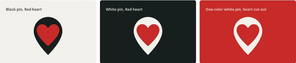
- The pin is solid with the heart cut through it and filled Red: a White pin on Brown or on a photo still has its Red heart.
- The logo files follow the same table: the files for light backgrounds carry the black pin, the files for dark backgrounds the white pin.
Show the numbers
| Pin | Where it goes |
|---|---|
| Black pin with a Red heart | On White, Warm grey, Cream, Sand and Kraft |
| White pin with a Red heart | On Black, Brown, Mocha and on a photo behind a scrim |
| One-color pin, heart cut out | On Red (the white one), and where print holds one ink: embroidery, stamps, a one-color partner row |
The name lettering
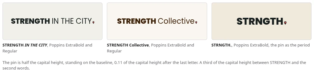
In the name lettering the pin is the full stop: STRENGTH or STRNGTH in Poppins ExtraBold, IN THE CITY, Collective or Showdown in Poppins Regular at the same size, then the pin.
- The pin inside the lettering stands as in The pin in text, rules 1 and 2.
- One pin per image or frame; the logo counts as one. The one exception: the logo, or the STRNGTH or oneSTRNGTH name lettering, may share a piece with the pin that ends the main headline (The pin at the end of a headline).
- A video or a carousel may end on the pin.
- On a repeating band (a wristband, a step and repeat) the name may repeat, each time with its pin. This is the other exception to one pin per image.
- A name ends with the pin only in the drawn lettering. In running text and inside a headline the name is plain text, written as in Writing names below.
Show the numbers
| Name lettering | How it is set |
|---|---|
| STRENGTH IN THE CITY | Poppins ExtraBold and Regular, the pin as the full stop |
| STRENGTH Collective | Poppins ExtraBold and Regular, the pin as the full stop |
| STRNGTH. | Poppins ExtraBold, the pin as the period |
| oneSTRNGTH. | Built like STRNGTH, the pin as the full stop |
| STRENGTH Showdown | Poppins ExtraBold and Regular, the pin as the full stop |
The pin in text
The pin can stand where a period would, after our name or at the end of a headline. These seven rules hold on every piece, on paper and on the website. They are for typed words and the name lettering; the logo files carry their own fixed pin, so never resize or move the pin inside a logo.
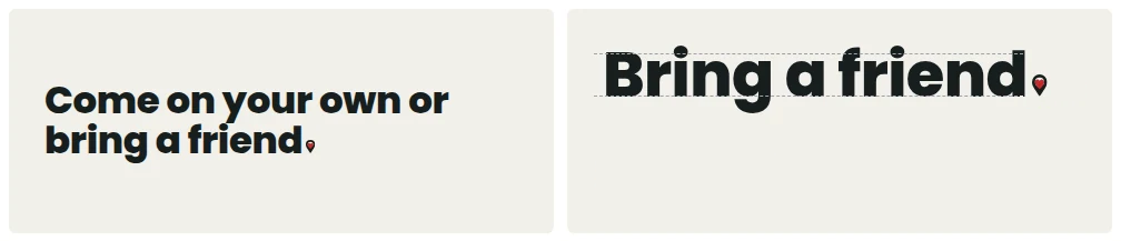
- Size: the pin is half as tall as a capital letter of the words it ends.
- Position: the tip of the pin stands on the baseline, the line the letters stand on, like a period.
- Only in place of a period. A line that ends in a question mark or an exclamation mark keeps it and takes no pin. No comma or period follows the pin.
- After our own names (STRENGTH IN THE CITY, STRENGTH Collective, STRNGTH., oneSTRNGTH., STRENGTH Showdown) or at the end of the one main headline of a main look, STRNGTH. or oneSTRNGTH. piece (The pin at the end of a headline). Not in the middle of a line, and not twice in one line.
- Color: the black pin on light grounds, the white pin on dark grounds (The heart pin). The heart is always Red.
- Small reading text gets a normal period. At that size the pin is too small to read, so write "STRNGTH." with a plain period, and word the sentence so no comma follows it.
- Use the pin sparingly. It works best as the period after our name or one main headline. Anywhere else, ask if it earns its place.
The pin at the end of a headline
On a STRENGTH IN THE CITY main look piece and on a STRNGTH. or oneSTRNGTH. piece (post, story, flyer, poster, sign, deck cover) the one main headline ends in the heart pin where its period would be. Its size, gap, color and the question mark rule are in The pin in text.
- Only the one main headline of a piece takes the pin. Never a subhead, text, caption, button or label.
- Our name inside a headline is plain headline text; the pin still goes only at the end.
- Main look, STRNGTH. and oneSTRNGTH. only. STRENGTH Collective and STRENGTH Showdown pieces carry the pin at the end of their name lettering, so their headlines take no pin. Rebels for a Cause has no pin.
- On a web page the one main headline may end in the pin too (the Home headline, the slogan that closes Our Story).
- On our own accounts the headline pin is the mark: the logo is not needed, and no pin goes in a corner as well.
- On anything that travels without us (a flyer, a poster, an ad, a partner's page) the badge logo stays top left and the headline still ends in the pin.
When to use what
- The pin stands alone only where our name is already close by: on our own accounts, our website and at our events. Anything that travels without us carries the badge logo or the name lettering (The pin at the end of a headline).
Show the numbers
| Where | Use this |
|---|---|
| Profile picture | The profile picture file, uploaded as is (Profile pictures below) |
| Poster, flyer, merch, signs, stickers | The badge logo; a main look headline on it still ends in the pin |
| A flyer, post or ad for one city's event (Chicago, Austin) | The main Red badge logo, never the city badge |
| City merch (a shirt or a sticker for one city) | That city's badge |
| A post on our own account | A main look headline that ends in the pin: that pin is the mark. Otherwise the badge logo, or the icon pin alone in a corner (Size) |
| Website header | The badge logo, hanging below the bar (Layout, Web, Header) |
| Email signature, email or newsletter top, banners | The badge logo; the header logo only where the badge does not look good or does not fit |
| Website footer | The badge logo, the slogan under it (Partners, Our name at the bottom) |
| Deck | The badge logo on the cover and on the last slide, no logo on the slides between |
| Sponsor row | The badge logo, then the partner logos; the header logo only where the badge does not look good in the row |
| Partner or ticket site that asks for a wide logo | The header logo |
| Wristband | The name lettering, repeating, each time with its pin |
| A headline that is only our name | The name lettering, the pin as its full stop |
| A main look, STRNGTH. or oneSTRNGTH. headline that would end in a period | The pin in place of the period (The pin at the end of a headline) |
| STRNGTH., oneSTRNGTH., STRENGTH Collective and STRENGTH Showdown pieces, any format | Their own name lettering leads, not the badge logo |
| Browser tab and app icon | The badge logo, filling the square |
| Map markers, signs that point the way, a piece inside the collage | The icon pin |
| A spot too small for the badge logo (Size) | The header logo, or the icon pin where even that does not fit |
| The end of a post or video | The pin, as long as the logo or the pin also shows early |
Size
- On a piece the badge logo is the short side of the piece divided by 7.5 (144 px on a 1080 post). The size for each format is in Layout, Formats.
- In the corner of a post (when no headline ends in the pin) the icon pin is as tall as the badge logo would be.
- At the end of a headline the pin is sized to the headline (The pin in text, rule 1).
- STRNGTH., STRENGTH Collective and STRENGTH Showdown pieces carry the name lettering instead of the logo, top left, about a third of the short side wide.
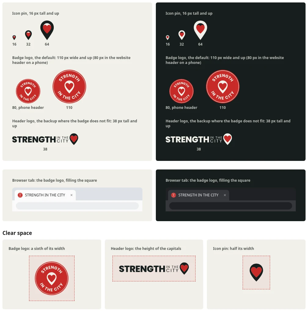
Show the numbers
At real size, the smallest each one may go:
| Mark | Smallest size |
|---|---|
| Icon pin | 16 px on screen, 5 mm in print |
| Header logo | 38 px tall on screen |
| Badge logo | 110 px wide on screen (80 px in the website header on a phone), 25 mm in print |
Clear space
- Around the header logo: the height of the STRENGTH capitals, on every side.
- Around the badge logo: a sixth of its width, on every side.
- Around the pin alone: half the pin's width, on every side.
Position
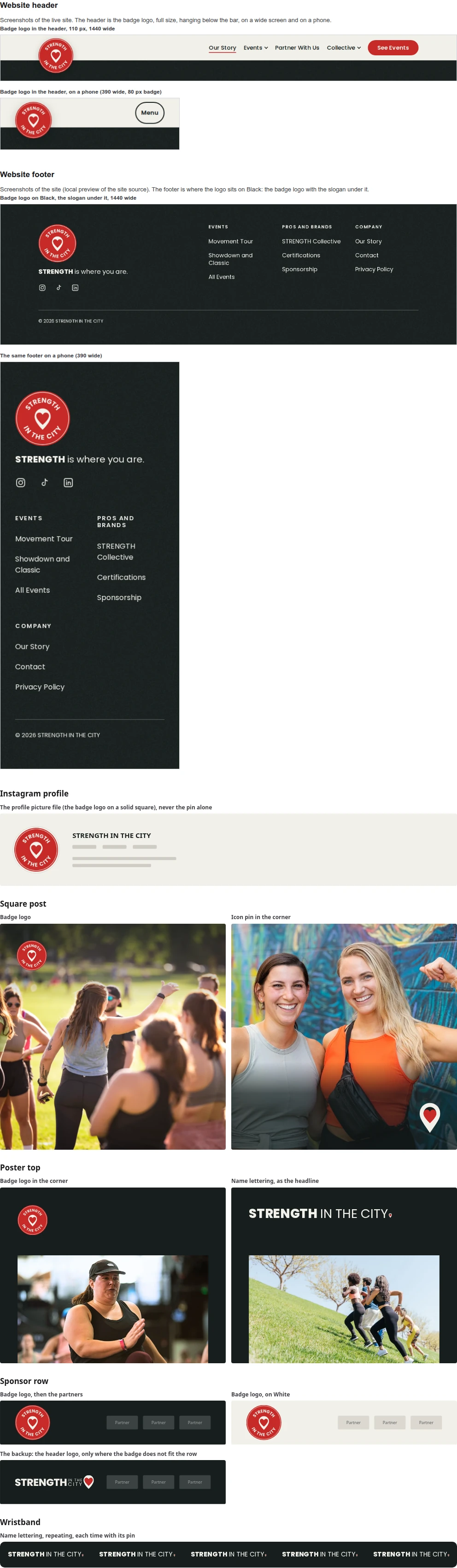
- In a corner, on the margins. Top left is the default; on our own posts a bottom corner is fine too.
- The logo, the pin (the pin at the end of a headline counts) or our name is on every post, flyer and page, at the top or in a corner, and in the first 3 seconds of every video; never only as the sign-off.
- Which mark goes in which spot is in When to use what. The picture shows them in real spots.
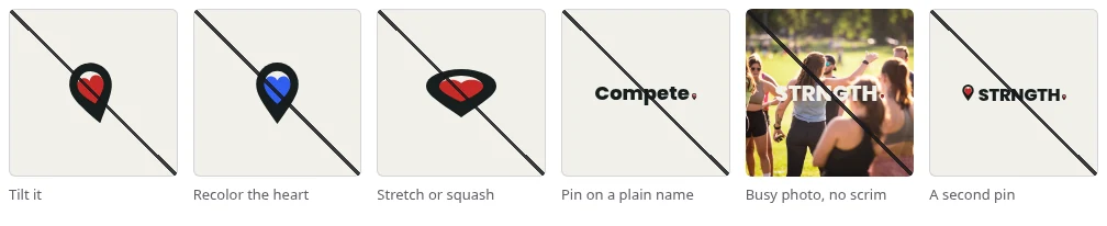
Never
- Tilt the pin.
- Recolor the heart.
- Stretch or squash the pin or the logo.
- Redraw, recolor or retype the logo.
- Put the pin on a plain name (for example Compete).
- Set the name lettering on a busy photo with no scrim.
- Add a second pin.
Logo Family
- The four named brands are drawn in the name lettering, the pin as the full stop: STRENGTH IN THE CITY, STRENGTH Collective, STRNGTH. and STRENGTH Showdown. oneSTRNGTH. is built like STRNGTH.
- Every other name is plain words, never with the pin: City Events, City Pop-Ups, Movement Tour, Compete, Nights for a Cause, Retreats, Education, Certifications, Partnerships, Sponsors, Vendors and Produced Events.
- Rebels for a Cause keeps its own badge and takes no pin (Brand Board, Rebels for a Cause, Fixed).
- A Collective series uses its series lockup (Brand Board, STRENGTH Collective, Series lockups).
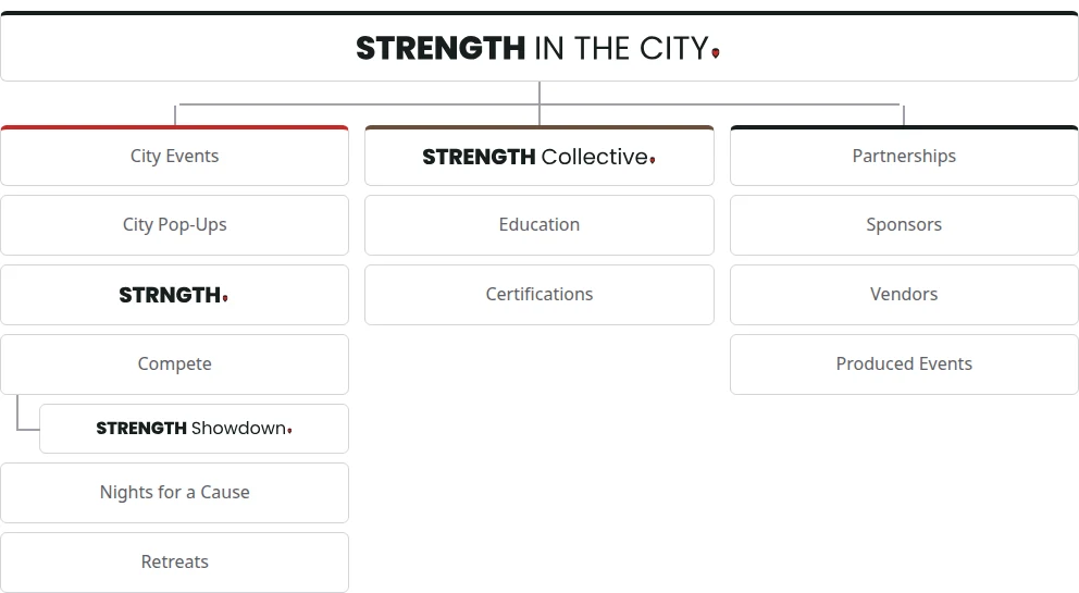
- The family tree: STRENGTH IN THE CITY on top. Under it three branches. City Events, in plain words, with City Pop-Ups, STRNGTH., Compete with its event STRENGTH Showdown set in under it, Nights for a Cause and Retreats. STRENGTH Collective, with Education and Certifications. Partnerships, in plain words, with Sponsors, Vendors and Produced Events.
Profile pictures
- Every account changes its profile picture on one changeover day: the main account, the twelve city accounts and the Collective accounts, all in one move. Until that day, every account keeps the picture it has today.
- Upload the profile picture file as is. Never a photo, a flyer or an event title as a profile picture, and never the pin alone.
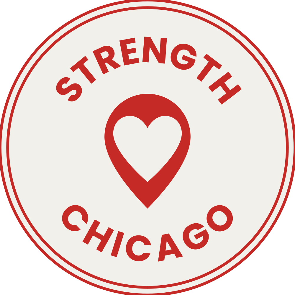
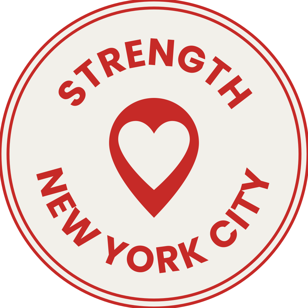
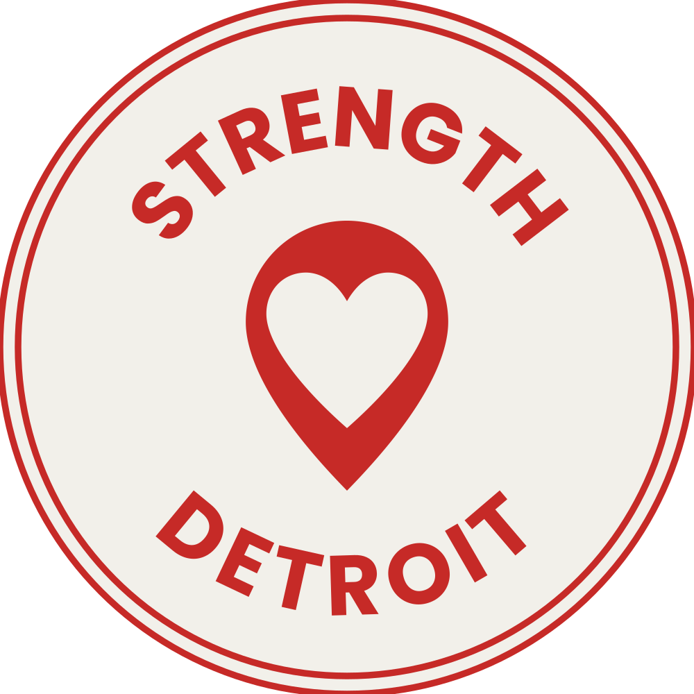
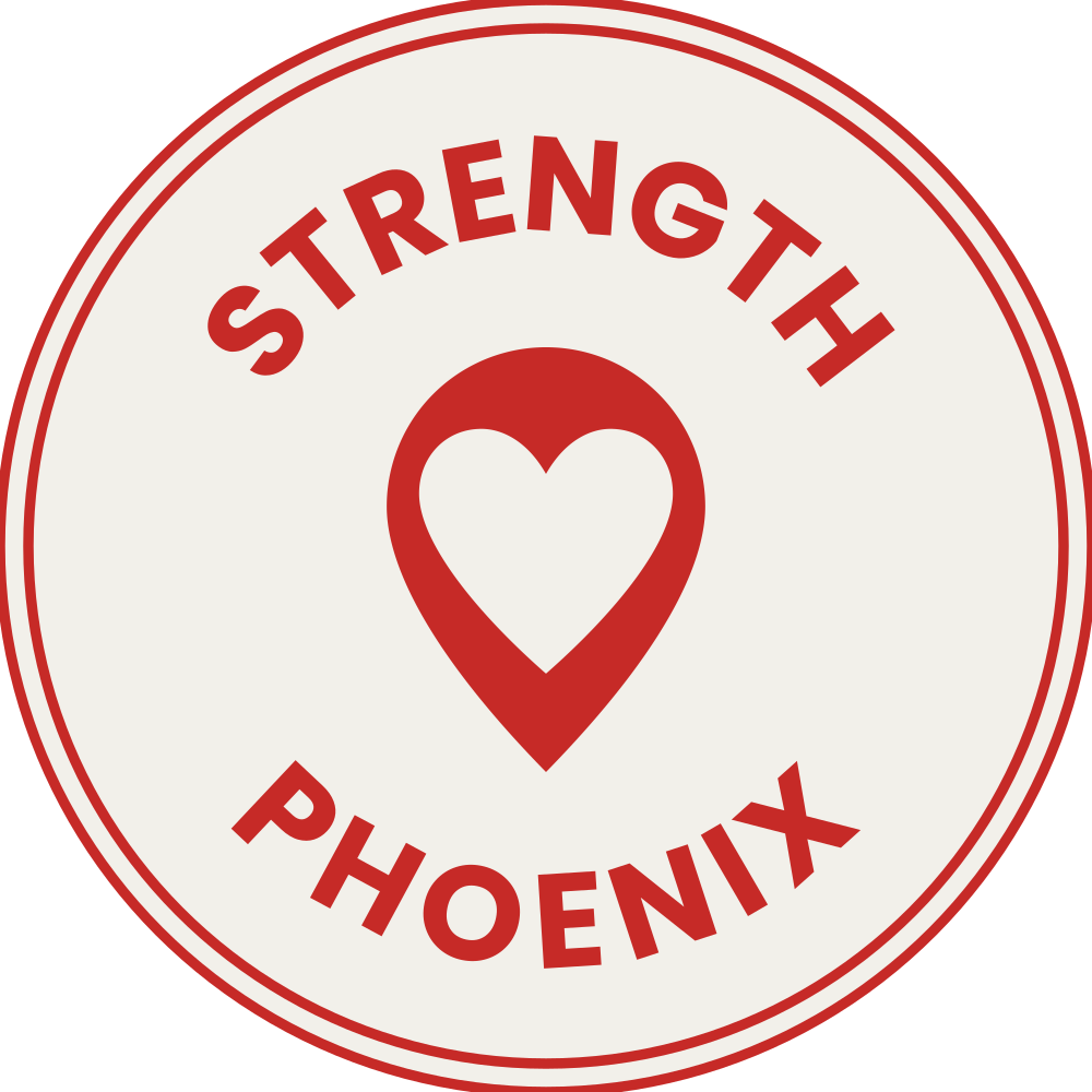
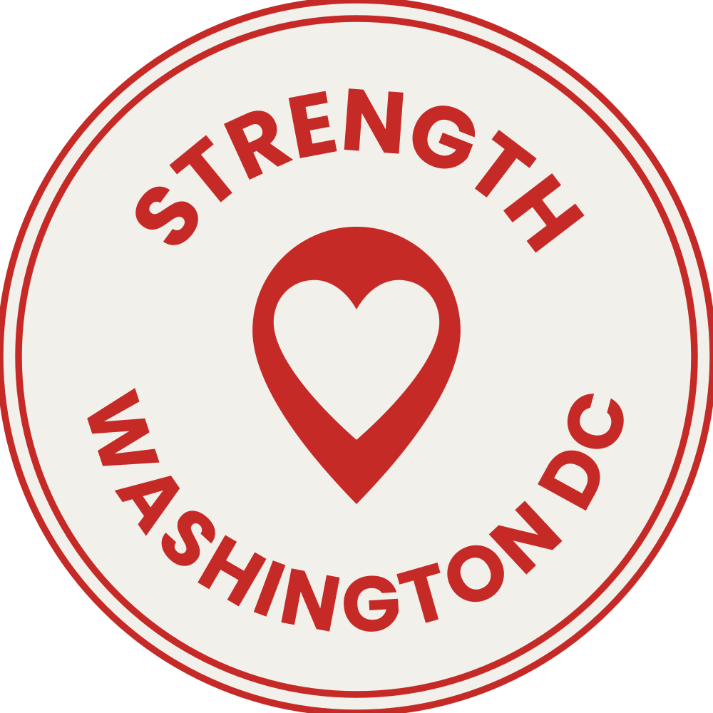
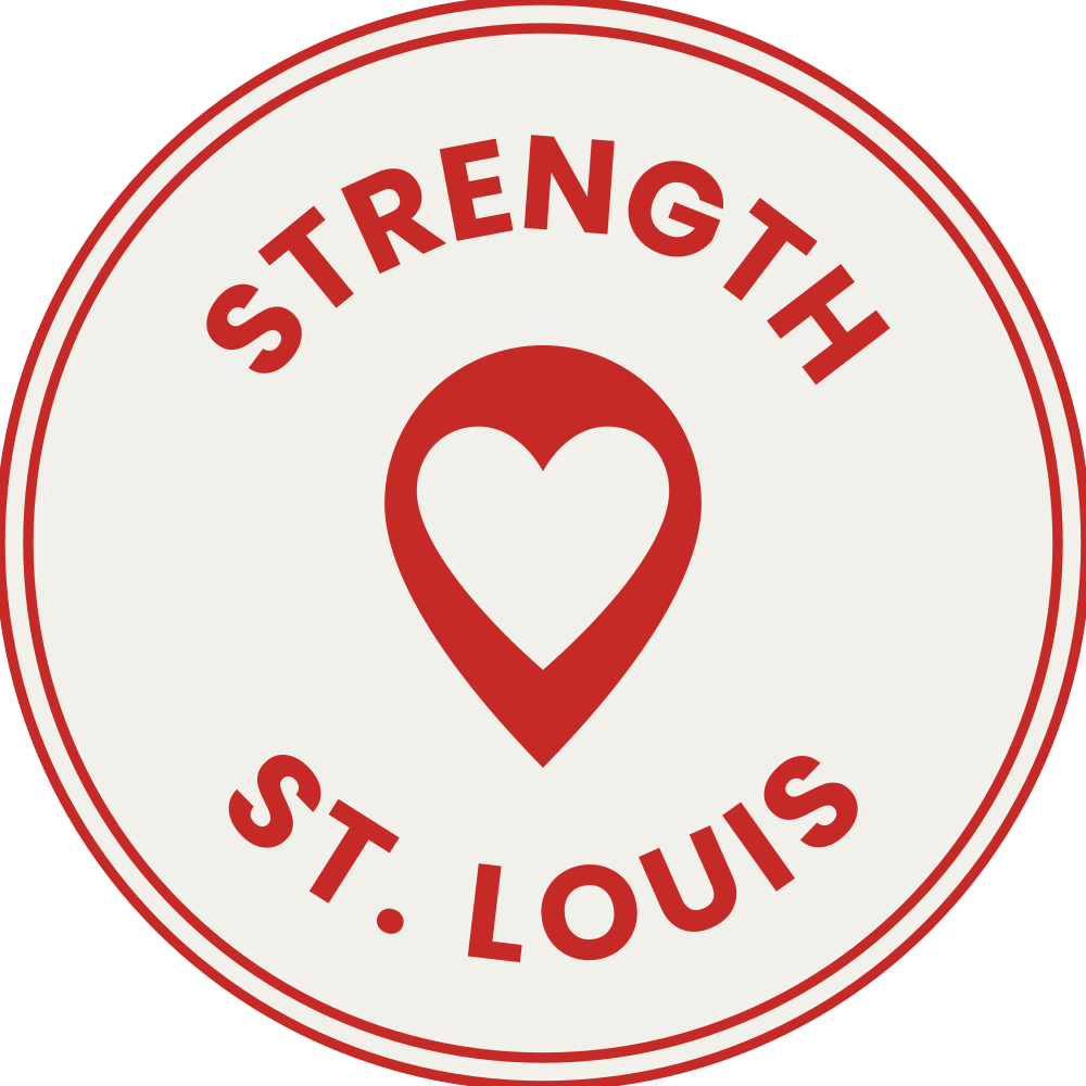
Every city badge is in the downloads below.
Show the numbers
| Account | Its profile picture |
|---|---|
| The main account, and anything that speaks for the whole company | sitc-profile-picture-light or sitc-profile-picture-dark: the badge logo on a solid square, made to fill the circle crop |
| Each of the twelve city accounts | Its city badge: the badge logo turned around, a White circle with a Red outer edge and a thin Red ring just inside it (the same double ring as the badge logo), Red words and a Red pin, the city spelled out on the bottom line (STRENGTH CHICAGO). It goes only on its city account's profile picture and on that city's merch, nowhere else: every extra place a city badge shows is a place the main badge does not, and one badge gets known faster. |
| The Collective accounts | The STRENGTH Collective badge: the same build with its own name, in Mocha and Cream, the heart cut out so the Mocha shows. Never teal, never a new color for a branch. |
| Rebels for a Cause | The Rebels badge (Brand Board, Rebels for a Cause, Fixed) |
| STRNGTH. and oneSTRNGTH. | No account yet. When one opens: the STRNGTH name lettering, the pin as the full stop. |
The logo and the pin
Which file goes where: Logo, When to use what.




- The SVG files need no font installed. The PNG files are 2000 px on the long side (the profile pictures 1080 px square), on a clear ground; the one-color PNG files are in Black #171F1E.
- No file has a built-in margin: keep the clear space around it (Logo, Clear space).
- The "for dark backgrounds" files are drawn a little lighter on purpose, so the white reads as heavy as the black does. Never make one by recoloring a light backgrounds file.
The badges
A city badge goes only on its city account's profile picture and on that city's merch; the STRENGTH Collective badge is the Collective's own logo. Where each one goes: Logo, Profile pictures.




Color
- Each look uses only its own colors. Never a new color or a new color set for an event.
- A STRNGTH. piece always shows its seven colors, even as a small touch (Brand Board, STRNGTH. and oneSTRNGTH., Colors).
- Text must be easy to read: pick a text and ground pair from its look's allowed list, and put a scrim behind text on a photo.
Every look
- These codes are the only brand colors, on every piece and every playbook page. Each look lists its own codes below. Color is the hardest thing for a brand to own, so it only works when it never changes.
- Branch colors: the City Events red, the Collective mocha, Partnerships black.
- Small text needs 4.5 to 1 contrast, so it uses the text code where a color has one. That way everyone can read it, people with weaker eyes too.
- Color is never the only signal: links are underlined, areas carry their names, states carry words. Some people cannot tell colors apart.
- Large text is 24 px and up, or 19 px and up in a bold weight (in print: 18 pt, or 14 pt bold).
- Text on a photo sits on a scrim (Photos).
Main look: STRENGTH IN THE CITY and STRENGTH Showdown
#C62A27 Black
#171F1E White
#F2F0EA Warm grey
#E4E2DD
- One red, #C62A27. A piece has at most one full red band or ground.
- STRNGTH. borrows this red as its S color (Brand Board, STRNGTH. and oneSTRNGTH., Colors).
- Sign words and pattern names are large text: use the allowed pairs below.
Text on a color, allowed:
| Text on ground | Contrast | Normal text 4.5:1 | Large text, graphics 3:1 | Use |
|---|---|---|---|---|
| Black on White | 14.73:1 | Pass | Pass | Any text |
| Black on Warm grey | 12.96:1 | Pass | Pass | Any text |
| White on Black | 14.73:1 | Pass | Pass | Any text |
| White on Red | 4.90:1 | Pass | Pass | Any text |
| Red on White | 4.90:1 | Pass | Pass | Any text |
| Red text (#9C2721) on White | 6.76:1 | Pass | Pass | Any text |
| Red text (#9C2721) on Warm grey | 5.95:1 | Pass | Pass | Any text |
| White on Red text (#9C2721) | 6.76:1 | Pass | Pass | Any text |
| Red on Warm grey | 4.31:1 | No | Pass | Large text and graphics only |
| Black on Red | 3.01:1 | No | Pass | Large text and graphics only |
Text on a color, not allowed:
| Text on ground | Contrast | Normal text 4.5:1 | Large text, graphics 3:1 | Use |
|---|---|---|---|---|
| Red on Black | 3.01:1 | No | Pass | Never for text |
Show the numbers
| Color | Code | What it is for |
|---|---|---|
| STRENGTH red | #C62A27 · text #9C2721 | The heart in the pin, one strong band, small accents. Red text on warm grey uses the text code. |
| Black | #171F1E | Text, and the pin on light grounds. |
| White | #F2F0EA | The page, and the pin on dark grounds. Never pure white. |
| Warm grey | #E4E2DD | Quiet grounds and panels. |
STRNGTH. and oneSTRNGTH.
STRNGTH. has seven colors, one per letter, always in this order: S Red, T Teal, R Yellow, N Pink, G Cobalt, T Orange, H Olive. Always take the codes from this table.
#C62A27 Teal
#00968F Yellow
#E4BE22 Pink
#FF48B0 Cobalt
#2F4FC0 Orange
#FF6C2F Olive
#7E9424 Kraft
#F0E9DC
- Every STRNGTH. piece shows the seven colors, together and in this order. They may be a small touch (a stripe, the letters, an accent); the ground and the rest of the piece are free.
- All seven may show on one piece; never in another order.
- The seven colors are a key to the letters. The name lettering itself stays one color: Black, or White on Black, never in colors.
- A letter that stands alone for its area (a sign, a map, a schedule row) is Black on its color, and White on Red and on Cobalt.
- Black is the eighth ink: one Black paint stroke with Red splatter on it, and Black halftone dots or splatter. Black never stands for a letter or an area.
- Areas: each letter's experience (SWEATYARD for S, through HOMEBASE for H) takes that letter's color on maps, signs, schedules and instructor posts, always with the experience's name next to it, never the color alone.
- A city never gets a color.
- S Red is the STRENGTH red; its text rows are in Brand Board, Main look: STRENGTH IN THE CITY and STRENGTH Showdown, Colors.
Text on a color, allowed:
| Text on ground | Contrast | Normal text 4.5:1 | Large text, graphics 3:1 | Use |
|---|---|---|---|---|
| Black on Kraft | 13.90:1 | Pass | Pass | Any text |
| Black on Yellow | 9.34:1 | Pass | Pass | Any text |
| Black on Orange | 5.94:1 | Pass | Pass | Any text |
| Black on Pink | 5.44:1 | Pass | Pass | Any text |
| Black on Olive | 4.91:1 | Pass | Pass | Any text |
| Black on Teal | 4.60:1 | Pass | Pass | Any text |
| White on Cobalt | 7.00:1 | Pass | Pass | Any text |
| White on Red | 5.58:1 | Pass | Pass | Any text |
| Black on Red | 3.01:1 | No | Pass | Large text and graphics only |
| White on Teal | 3.65:1 | No | Pass | Large text and graphics only |
| White on Olive | 3.42:1 | No | Pass | Large text and graphics only |
| White on Pink | 3.09:1 | No | Pass | Large text and graphics only |
Text on a color, not allowed:
| Text on ground | Contrast | Normal text 4.5:1 | Large text, graphics 3:1 | Use |
|---|---|---|---|---|
| White on Orange | 2.82:1 | No | No | Never for text |
| Black on Cobalt | 2.40:1 | No | No | Never for text |
| White on Yellow | 1.80:1 | No | No | Never for text |
Show the numbers
| Letter | Color | Code |
|---|---|---|
| S | Red | #C62A27 |
| T | Teal | #00968F |
| R | Yellow | #E4BE22 |
| N | Pink | #FF48B0 |
| G | Cobalt | #2F4FC0 |
| T | Orange | #FF6C2F |
| H | Olive | #7E9424 |
| Kraft | #F0E9DC, the paper ground |
STRENGTH Collective
#FAF6F0 Sand
#E2D7C8 Taupe
#B9A795 Mocha
#6B4F3A Brown
#3B1F07
- Warm and tonal: Cream and Sand grounds, Brown type, Taupe lines, one Mocha accent.
- No cool color. On a Collective piece the only bright color is the red heart in the pin.
Text on a color, allowed:
| Text on ground | Contrast | Normal text 4.5:1 | Large text, graphics 3:1 | Use |
|---|---|---|---|---|
| Black on Cream | 15.59:1 | Pass | Pass | Any text |
| Black on Sand | 11.82:1 | Pass | Pass | Any text |
| Brown on Cream | 14.08:1 | Pass | Pass | Any text |
| Brown on Sand | 10.68:1 | Pass | Pass | Any text |
| Cream on Brown | 14.08:1 | Pass | Pass | Any text |
| Mocha on Cream | 6.95:1 | Pass | Pass | Any text |
| Mocha on Sand | 5.27:1 | Pass | Pass | Any text |
| Cream on Mocha | 6.95:1 | Pass | Pass | Any text |
| White on Mocha | 6.57:1 | Pass | Pass | Any text |
| Taupe text (#5B5048) on Cream | 7.26:1 | Pass | Pass | Any text |
| Taupe text (#5B5048) on Sand | 5.51:1 | Pass | Pass | Any text |
Text on a color, not allowed:
| Text on ground | Contrast | Normal text 4.5:1 | Large text, graphics 3:1 | Use |
|---|---|---|---|---|
| Red on Brown | 2.72:1 | No | No | Never for text |
| Mocha on Taupe | 3.22:1 | No | Pass | Never for text |
| Taupe (#B9A795) on Cream | 2.16:1 | No | No | Never for text |
| Taupe (#B9A795) on Sand | 1.64:1 | No | No | Never for text |
Show the numbers
| Color | Code | What it is for |
|---|---|---|
| Cream | #FAF6F0 | The base. |
| Sand | #E2D7C8 | Panels and grounds. |
| Taupe | #B9A795 · text #5B5048 | Lines. Quiet text uses the text code. |
| Mocha | #6B4F3A | The one accent: lines, shapes, labels, section numbers and buttons. |
| Brown | #3B1F07 | Text and headlines. |
Rebels for a Cause
#141210 Ink, raised
#1B1815 Ink, deep
#0E0C0B Ivory, type
#F1EBDF Ivory, quiet
#C3B9A9 Ivory, quieter
#978D7E Rebels red
#C62A27 Red accent
#E04A42 Red on paper
#A3211E Paper
#EFE8DA
- No gold or metallic. Red carries action; cream and ivory carry prestige.
- The text on a color tables hold no Rebels rows; its pairs are set as above.
Show the numbers
| Color | Code |
|---|---|
| Ink | #141210 |
| Ink, raised | #1B1815 |
| Ink, deep | #0E0C0B |
| Ivory, type | #F1EBDF |
| Ivory, quiet | #C3B9A9 |
| Ivory, quieter | #978D7E |
| Rebels red | #C62A27 |
| Red accent | #E04A42 |
| Red on paper | #A3211E |
| Paper | #EFE8DA |
Type
- Poppins on everything: ExtraBold for headlines, Regular for text. The Collective adds its serif; Rebels for a Cause keeps Archivo.
- Script words in Seaweed Script on the main look, Cognito Scripto on the Collective. Holiday and the other Canva-only fonts are retired.
- Headlines in capitals or sentence case, as the piece wants; text in sentence case.
Which font, when
Find the job in the left column and the look you are making for. If a job is not in the table, use Poppins.
- Headlines and names stay in these fonts; supporting words may take another font for a series idea (Always on every piece, Yours to play with).
Show the numbers
| Job | Main look and STRENGTH Showdown | STRNGTH. | Collective | Rebels for a Cause |
|---|---|---|---|---|
| Our names (STRENGTH IN THE CITY, Collective, Showdown) | Poppins ExtraBold and Regular, as the name lettering | The same | The same | The same |
| Headlines | Poppins ExtraBold | Poppins ExtraBold | Noto Serif Display Light | Archivo heavy capitals |
| Everything people read: text, captions, buttons, labels, dates | Poppins | Poppins | Poppins | Archivo Regular |
| Big numbers: scores, section numbers | Poppins ExtraBold | Poppins ExtraBold | Noto Serif Display Light, Mocha (01, 02) | Archivo heavy capitals, as headlines |
| Series names (PLTS+, WMN+) | None | None | Elsie Black | None |
| Script words, the play (Always on every piece, Yours to play with) | Seaweed Script | None | Cognito Scripto | Instrument Serif italic in red, two to four words |
Fonts and where to get them
Every brand font is free to use everywhere (websites, Canva, print, ads, merch), so a piece looks the same in every place. A font that lives only inside Canva is never a brand font. Install each one on your computer and add it to the Canva brand kit.
| Font | Used for | Get it |
|---|---|---|
| Poppins | Every look: names, headlines, text | fonts.google.com/specimen/Poppins |
| Seaweed Script | The script word, main look and STRENGTH Showdown | fonts.google.com/specimen/Seaweed+Script |
| Noto Serif Display | Collective headlines and numbers | fonts.google.com/specimen/Noto+Serif+Display |
| Elsie Black | Collective series names (PLTS+, WMN+) | fonts.google.com/specimen/Elsie |
| Cognito Scripto | The Collective script | Nearzoo Studio, free for any commercial project (LICENSE-cognito-scripto-maker-note.txt); web file CognitoScripto.woff2 |
| Archivo | Rebels for a Cause headlines and text | fonts.google.com/specimen/Archivo |
| Instrument Serif | The Rebels red flourish | fonts.google.com/specimen/Instrument+Serif |
Each Google font is open (SIL Open Font License 1.1).
Retired: Holiday (use Seaweed Script), Brittany Signature (use Cognito Scripto) and Brasika Display (use Elsie Black). All three live only inside Canva and cannot be used anywhere else, so a piece set in them looks different from the website and print.
The rules behind the table
- One family for the main look and every branch: Poppins, the bold font people already know. ExtraBold for headlines and our names, Regular for text.
- Two set exceptions: the Collective adds its own headline serif (Brand Board, STRENGTH Collective, Fonts), and Rebels for a Cause keeps its own set look (Brand Board, Rebels for a Cause, Fonts). Both came with a look of their own, and our name, the part people know, stays the same on them.
- A script is never in a name. A name has to look the same every time, so its font never changes.
- One scale: each step is 1.333 times the one below (1.2 on phones). Body is step 0 for each format.
- Where a headline ends in the heart pin: Logo, The pin at the end of a headline.
Type styles
The Collective's own styles (headline, number, script accent, series name) are in Brand Board, STRENGTH Collective, Fonts.
Show the numbers
| Style | Face and weight | Step | Case |
|---|---|---|---|
| Display | Poppins ExtraBold 800 | 5 | Capitals or sentence, the maker's call |
| Heading One | Poppins ExtraBold 800 | 3 | Capitals or sentence, the maker's call |
| Heading Two | Poppins ExtraBold 800 | 2 | Capitals or sentence, the maker's call |
| Subhead | Poppins SemiBold 600 | 1 | Sentence |
| Body | Poppins Regular 400 | 0 | Sentence |
| Bullets and Numbering | Poppins Regular 400, numbers SemiBold 600 | 0 | Sentence |
| Emphasis | Poppins SemiBold 600 | 0 | As the line |
| Caption | Poppins Medium 500 | −1 | Sentence |
| Button | Poppins SemiBold 600 | 0 | Title Case |
| Label | Poppins SemiBold 600 | −1 | Capitals |
| Script accent (main look, STRENGTH Showdown) | Seaweed Script, in the look's own colors | Free | Lowercase, tilted |
Case
- Headlines: capitals or sentence case, the maker's call (Always on every piece, Yours to play with). All text: sentence case.
- Buttons, menu links and footer links: Title Case, a capital on each word and small words lowercase: Get Tickets, See Dates, Nights for a Cause.
- Labels: capitals, in the Label style.
- Names keep their own casing everywhere (Words, Writing names).
Sizes per format
Show the numbers
| Style (step) | Web desktop | Web phone | Social 1080 | Deck slide | Flyer, Letter | Poster 18 x 24 |
|---|---|---|---|---|---|---|
| Display (5) | 76 px | 40 px | 152 px | 118 px | 51 pt | 118 pt |
| Heading One (3) | 43 px | 28 px | 85 px | 66 px | 28 pt | 66 pt |
| Heading Two (2) | 32 px | 23 px | 64 px | 50 px | 21 pt | 50 pt |
| Subhead (1) | 24 px | 19 px | 48 px | 37 px | 16 pt | 37 pt |
| Body, Bullets, Emphasis, Button (0) | 18 px | 16 px | 36 px | 28 px | 12 pt | 28 pt |
| Caption, Label (−1) | 14 px | 13 px | 27 px | 21 px | 9 pt | 21 pt |
| Each step | × 1.333 | × 1.2 | × 1.333 | × 1.333 | × 1.333 | × 1.333 |
Specimens
The Collective specimens are in Brand Board, STRENGTH Collective, Fonts.
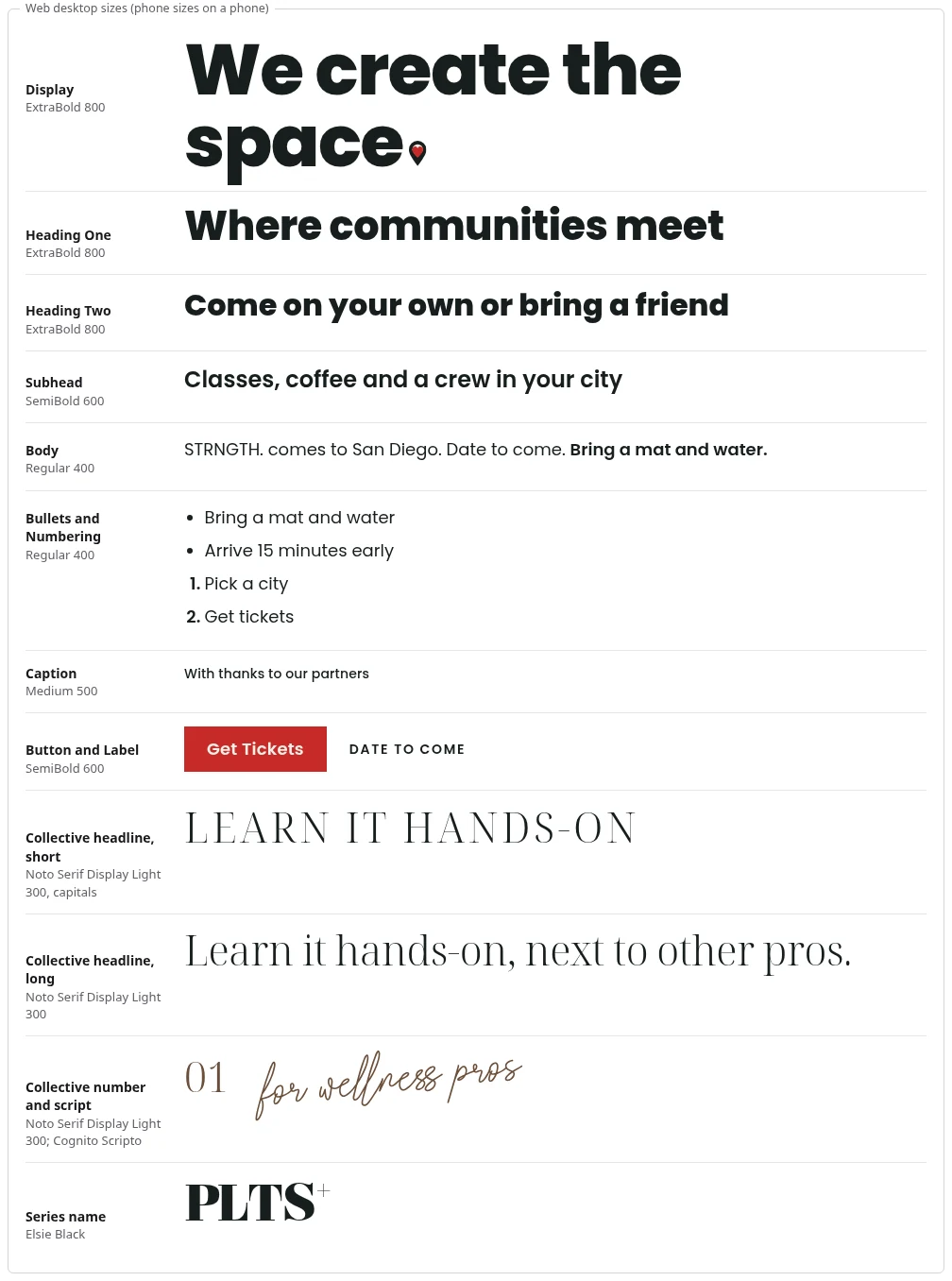
Show the numbers
Web desktop sizes (phone sizes on a phone):
| Style | Weight | Sample |
|---|---|---|
| Display | ExtraBold 800 | We create the space. |
| Heading One | ExtraBold 800 | Where communities meet |
| Heading Two | ExtraBold 800 | Come on your own or bring a friend |
| Subhead | SemiBold 600 | Classes, coffee and a crew in your city |
| Body | Regular 400 | STRNGTH. comes to San Diego. Date to come. Bring a mat and water. (the last sentence in Emphasis) |
| Bullets and Numbering | Regular 400 | Bring a mat and water · Arrive 15 minutes early (bullets); 1. Pick a city 2. Get tickets (numbers) |
| Caption | Medium 500 | With thanks to our partners |
| Button and Label | SemiBold 600 | Get Tickets (Button) · Date to come (Label) |
Photos
- Real photos from our own events, people together. Never stock, never AI-made people.
- Only cleared photos.
- Text on a photo sits on a scrim so it is easy to read.
Every look
- Real photos from our own events only: people together. Never stock, never AI-made people. Two exceptions: on a Collective piece the pro may be the hero, one confident portrait of the pro at work; and the STRNGTH. collage is built on one cutout portrait (Brand Board, STRNGTH. and oneSTRNGTH., STRNGTH. collage). We create the space where communities meet, so our photos show that space and the crew in it.
- Only cleared photos.
- The look of the photo is free: color, grain or a warm film look are all fine, as long as people look like themselves. Each look file has its own photo feel (Brand Board, Main look: STRENGTH IN THE CITY and STRENGTH Showdown, Brand Board, STRENGTH Collective, Brand Board, STRNGTH. and oneSTRNGTH. and Brand Board, Rebels for a Cause, Photos).
- Text on a photo sits on a scrim: Black at 70% behind the text, fading to clear over the rest (Brown at 70% on the Collective). Type and the pin go white or cream on it.
Layout
- Keep everything inside the margins, and keep clear space around the logo.
- Each format has its size and its margins; the rest of the layout is yours (Always on every piece, Yours to play with).
- Stories and reels keep the top 250 px and the bottom 320 px free of words people must read.
Spacing
- One unit, U: 8 px on screen, 1/8 in (3.2 mm) in print. Every space and box is a whole number of units. One unit keeps the spacing the same on every piece, whoever builds it.
- Steps: 1, 2, 3, 4, 6, 8, 12 and 16 U (8, 16, 24, 32, 48, 64, 96, 128 px).
- Margin: the short side divided by 13.5, rounded to whole units. Print adds 1 U of bleed past the trim; a photo or ground that runs to the edge runs through the bleed.
Formats
The Logo column is the badge logo's height unless it says otherwise. Where a piece carries the name lettering instead of the logo: Logo, Size.
Show the numbers
| Format | Size | Margin | Keep clear | Logo | Footer line | Body |
|---|---|---|---|---|---|---|
| Square post | 1080 x 1080 px | 80 px (10 U) | Margins only | 144 px | 48 px | 36 px |
| Portrait post | 1080 x 1350 px | 80 px (10 U) | Margins only | 144 px | 48 px | 36 px |
| Carousel | 1080 x 1350 px, every slide the same | 80 px (10 U) | Margins only | 144 px | 48 px | 36 px |
| Story or reel cover | 1080 x 1920 px | 80 px at the sides | Top 250 px, bottom 320 px. Headline inside the middle 1080 x 1350 | 144 px | 48 px | 36 px |
| Web banner | 1920 x 1080 px | The web grid | Header 80 px | Badge logo, 110 px hanging below the bar (80 px on phones) | 32 px | 18 px |
| Email or newsletter | 600 px wide, one column | 24 px at the sides | Margins only | Badge logo, 110 px (header logo, 38 px tall, where the badge does not look good or does not fit) | 13 px | 16 px |
| Deck slide | 1920 x 1080 px | 80 px (10 U) | Margins only | Badge logo 144 px on the cover and the last slide | 48 px | 28 px |
| Flyer US Letter | 8.5 x 11 in | 5/8 in (5 U) | Plus 1/8 in bleed | 1 1/8 in | 3/8 in (3 U) | 12 pt |
| Poster | 18 x 24 in | 1 3/8 in (11 U) | Plus 1/8 in bleed | 2 3/8 in | 3/4 in (6 U) | 28 pt |
Signs
- Signs people read from a distance: dark letters on a light ground, unless the sign is lit.
- Letters at least 1% of the reading distance tall, never under 22 mm (10 m away: 10 cm letters).
- Poppins, never the Collective serif or a script. Thin and curly letters are hard to read from far away.
- Signs that point the way look the same and sit in the same place at every turn; area colors follow the STRNGTH. colors rule (Brand Board, STRNGTH. and oneSTRNGTH., Colors), always with the area's name.
Web
Grid
- Desktop: words and buttons hold to a grid 1200 px wide at most; photos, grounds and collage run to the edge of the screen. That way a wide screen shows no empty bands at the sides.
- On a banner the photo or collage covers at least half the width.
- Text runs 8 columns wide at most on desktop. Short lines are easier to read.
- Sections sit 12 U (96 px) apart on desktop, 8 U (64 px) on phones, each on its own ground.
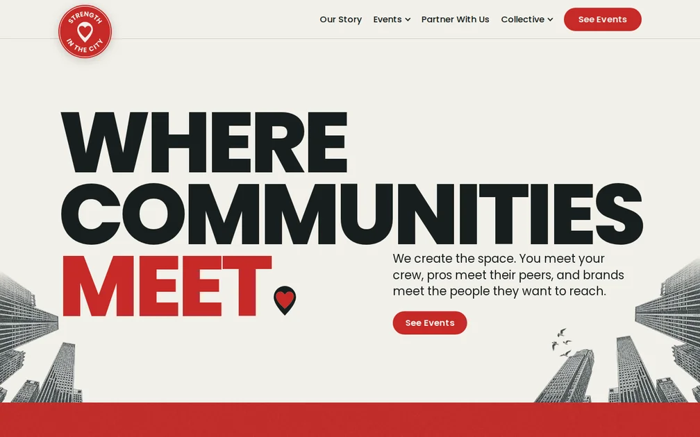
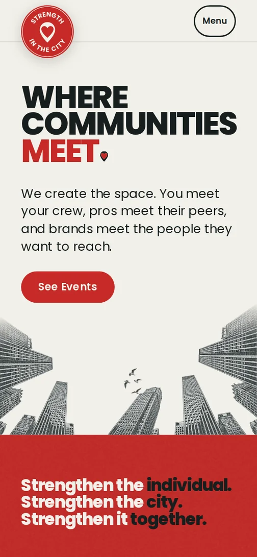
- The pictures are screenshots of the live home page, desktop (1440 wide) and phone (390 wide).
Header
- 80 px tall on desktop, 64 px on phones.
- Top left, the badge logo of that part of the site (the STRENGTH IN THE CITY badge, or the STRENGTH Collective badge on the Collective pages), 110 px wide on desktop and 80 px on phones, hanging below the bar like a stamp with a soft shadow; it links home.
- Links on the right in Body at Medium 500, 24 px apart, then one primary button. Links and buttons are in Title Case (Type, Case).
- On phones and tablets the links fold into a round Menu button, 48 px tall.
Buttons
- 48 px tall on every screen, 24 px side padding, Button style. One primary button per screen, so people see the one next step.
- Corners: fully round, as on the live site (the See Events button in the screenshot above).
- Secondary: a 2 px outline in the text color.
- On a calm Collective section the outline button leads.
Links and focus
- Links: text color with a 1 px underline, 3 px below the text; 2 px on hover. Sample: "Read the event guide before you come."
- Focus: a 2 px outline, 2 px out, Black on light grounds and White on dark. People who move through a page with the keyboard can see where they are.
Photos on the web
Photos: corners square on every look, the Collective too; the arch is the Collective's one special frame.
Show the numbers
| Screen | Columns | Gutters | Side margins |
|---|---|---|---|
| Desktop (1024 px and up) | 12 | 24 px | 48 px or more |
| Tablet (640 to 1023 px) | 8 | 24 px | 32 px |
| Phone | 4 | 16 px | 16 px |
| Look | Primary button |
|---|---|
| Main look, STRNGTH. pages too | Red with White text (4.90:1) |
| Collective | Mocha with Cream (6.95:1) |
Words
- Dates: Sat, May 15. Times: 9 am to 1 pm. Money: $39.
- Every name is written exactly as below: STRENGTH IN THE CITY, STRNGTH. with its period.
- Never make up a date, a price or a place. If it is not set, leave it out or write Date to come.
Numbers, dates and times
One way to write each, so nobody misreads a date, a time or a price.
- Numbers: numerals always (3 cities). Thousands with a comma: 1,200. Money: $39, never $39.00.
- Dates, one format: Sat, May 15. Add the year only for another year: Sat, May 15, 2027. No 15th. Unknown: Date to come.
- Times: 9 am, 9:30 am, 12 pm. A range uses "to": 9 am to 1 pm.
Writing names
- STRENGTH IN THE CITY is always in capitals, in text too.
- Every other name: STRENGTH in capitals, then a capital on each word: STRENGTH Collective, STRENGTH Showdown.
- STRNGTH. and oneSTRNGTH. keep their period, also mid sentence.
- Series keep their exact spelling: WMN+, MN+, PLTS+.
- Plain names: capital first letter, small words lowercase: Movement Tour, City Pop-Ups, Compete, Nights for a Cause, Retreats.
- The tour is the Movement Tour in menus, links and words; STRNGTH. is the day. The lettering is STRNGTH. alone, with Movement Tour set under it. Never "STRNGTH. Tour".
- A name keeps its own casing everywhere, also in a headline in capitals or a label.
- Only the word STRENGTH itself takes our capitals, and only as our name or as the first word of the slogan (STRENGTH is where you are). Other words, even ones built from it (strengthen, strong, stronger), are ordinary words in normal case: Strengthen the city. Why: the capitals have to mean our name; on another word they only look like a misspelled name.
- The everyday word strength is lowercase in a sentence: build strength, strength training. Why: capitals are how people spot our name. If every strength were in capitals, the capitals would stop meaning us, and plain sentences would read like an ad or like shouting.
- Bold: STRENGTH is ExtraBold only where the words are a design: the logos, the name lettering, a headline. In a sentence (a caption, an email, a paragraph) every word is plain weight and STRENGTH keeps its capitals: Join STRENGTH IN THE CITY in Chicago.
How we sound
How we sound to each reader (the people who come, pros, brands) is on the Brand Vision tab: Brand Vision, Tone of Voice.
Word list
Show the numbers
| Word | What it means here |
|---|---|
| Scrim | A dark see-through layer behind text on a photo, fading to clear over the rest (Photos). |
| Ground | The color or paper a piece sits on, such as White, Warm grey, Cream, Sand, Kraft, Ink or a full Red. |
| Lockup | A Collective series name in Elsie Black set together with its script word, in one tone. |
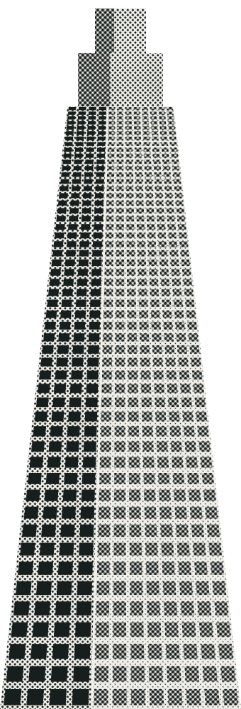
| Halftone | A texture of printed dots. The main look's towers use it; people never do. |
| Clear space | The empty space kept around the logo or the pin, with nothing in it (Logo, Clear space). |
| U | The one spacing unit: 8 px on screen, 1/8 in in print. Every space is a whole number of U. |
| Cutout | A photo of a real person cut around the person, never a rectangle; on STRNGTH. pieces, black and white with a white paper edge. |
| Collage piece | One shape in a collage: a tower, a sign, birds or rings in the City collage; a city thing or a class thing in cut paper in the STRNGTH. collage. |
| Name lettering | A named brand drawn in Poppins, the pin as the full stop (Logo, The name lettering). |
| Badge logo | Our name around the heart pin, in a Red circle: the default logo (Logo, The logo). |
| Header logo | Our name in one wide line, then the heart pin: the backup, only where the badge logo does not look good or does not fit (Logo, The logo). |
| Icon pin | The heart pin alone: map markers and a pin in a corner (Logo, The logo). |
| Pin | The heart pin, the mark every STRENGTH brand shares (Logo, The heart pin). |
| Footer line | The bottom row of a piece: sponsors on the right; our name on the left only on a piece with no STRENGTH in its name. |
STRNGTH. and oneSTRNGTH.
One letter, one experience, always in this order. Each has its own space, talent and partner. Written in capitals, as the names are set.
Show the numbers
| Letter | Experience | What it is |
|---|---|---|
| S | SWEATYARD | Movement |
| T | TEMPOCLUB | Music |
| R | REJUVEDEN | Recovery |
| N | NEUROLAB | Learn |
| G | GAMESCAPE | Play |
| T | THIRDSPACE | Connection |
| H | HOMEBASE | Culture |
Partners
- Our logo or name leads, top left. Partner logos sit smaller, together in one row at the bottom right.
- Never words in front of our name: no "presented by", "powered by" or "produced by".
- A signed deal that promises a size wins.
Partners
- Our logo or name leads: top left, at its size for the format. Rebels for a Cause and La Femme are the one exception (The Rebels line). A mark only gets known when it shows up big and in the same spot every time.
- Partner logos sit smaller, in one fixed zone: one row in the footer line, bottom right. Every extra name on a piece pulls the eye, so the partners sit together in one place.
- A partner logo is never taller than 1.5 X (X: the height of our STRENGTH capitals) and never wider than half our logo or name.
- A title sponsor may take one "presented by" line in words, in the Caption style, next to the event name (Our name at the bottom). That line is a slot the team sells to a title sponsor.
- A signed deal that promises a size wins over these sizes.
- The partner row drawing, a piece with no STRENGTH in its name: our name on the left in the name lettering without the pin, no words in front of it (The Rebels line), three partner logos in one row on the right.

Our name at the bottom
- Our name never has words in front of it: no "presented by", "powered by" or "produced by". "Presented by" is a title sponsor's slot, never ours.
- Every website footer carries the badge logo, with the slogan under it (Brand Vision, Brand Essence), and no words in front of it.
- A piece with no STRENGTH in its name (Rebels for a Cause, La Femme) carries our name once, bottom left: The Rebels line, below.
- A piece whose own name holds STRENGTH carries no parent line at all. STRENGTH Collective, STRNGTH., oneSTRNGTH. and STRENGTH Showdown already end in the pin; a STRENGTH Classic piece carries the badge logo at the top.
- Wherever our name is typed on a piece, it is the name lettering without the pin (Logo, The name lettering); in a sentence it is plain text (Words, Writing names).
- In a sentence the Collective is "the education arm of STRENGTH IN THE CITY", never "presented by".
The Rebels line
Rebels for a Cause and La Femme keep their own logo and look (Brand Board, Rebels for a Cause). Our name is one line, bottom left on the margin, apart from the sponsor logos: STRENGTH IN THE CITY typed as the name lettering without the pin (words, not the logo), with no words in front of it. Nothing else in the look changes.
Files
- Use the logo, badge and name lettering files as they are; never retype or redraw them.
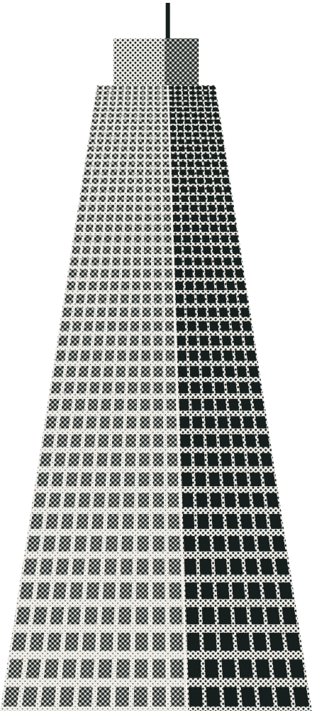
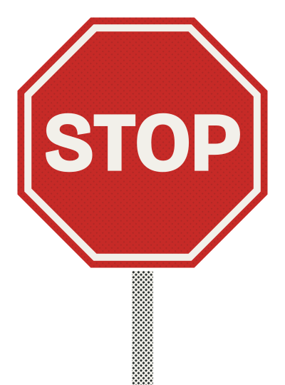
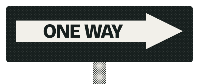
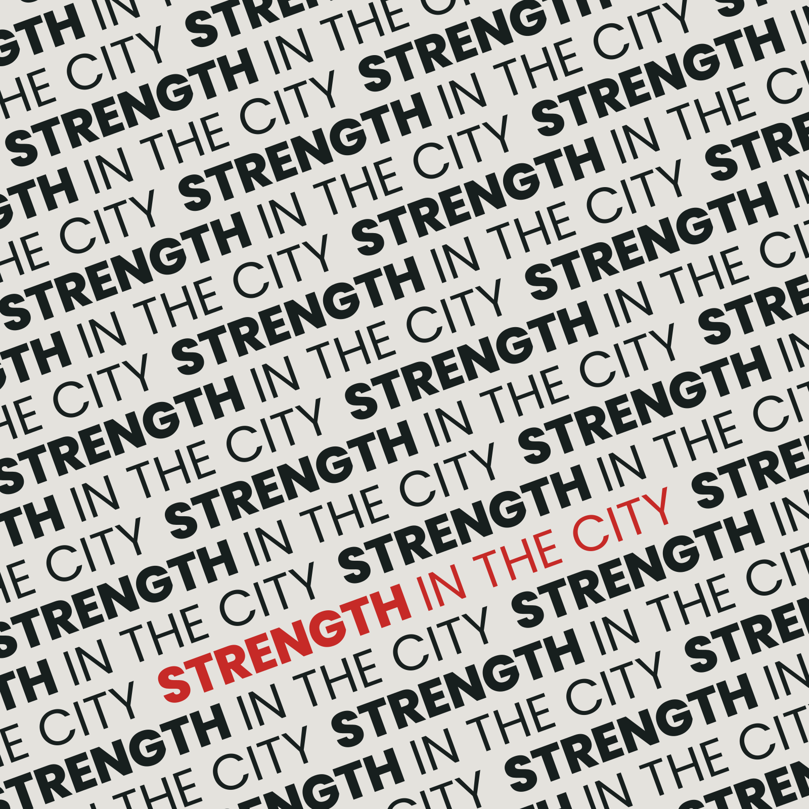
- The City collage files are examples; the artwork is yours to make.
- The fonts and where to get them are in Type, Fonts and where to get them.
City collage
Examples, not the kit. The artwork is the designer's to create.



























Templates
None yet. A template carries its look's rules inside it, so it is the one second copy of the rules. When one is made, add a line here: the template, its look, its format and where to open it, and check it again whenever its look file changes.
Who approves
- Liezyl approves every piece before it posts, for now.
- To ask for a change to this guide, post in #marketing-hq (Slack).
- Always open the link; never print or save a copy of these pages. The downloads are fine to use.
Who approves and how this guide changes
- This guide is the one source of truth for everyone at the company. It keeps changing, which is why you always open the link instead of keeping a copy.
- Prange Automations keeps this guide current by reading the approvals and feedback in the marketing channels (Slack).