


Brand Playbook

Each look on the live site and on example pieces: one way each was done, not the only way. What every piece needs is in Always on every piece; everything else is yours to play with.

This guide is the one source of truth for everyone at the company, and it keeps changing. Always open this link; never print, download or save a copy of these pages. The logo downloads are fine to use.

STRENGTH IN THE CITY

Bold, grounded, electric. These pieces are one way to do it: real event photos with the city collage, Red as the heart, Black, White and Warm grey around it.
Red #C62A27 Black #171F1E White #F2F0EA Warm grey #E4E2DD
Poppins ExtraBold for headlines, Regular for textSeaweed Script for script words
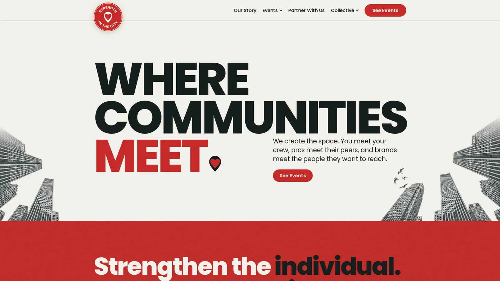
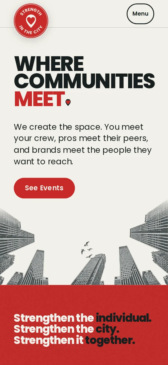
Screenshot of the STRENGTH IN THE CITY home page, first screen at 1920 wide: the header, the headline WHERE COMMUNITIES MEET ending in the pin, the city towers along the bottomScreenshot of the same first screen on a phone, 390 wide
Web bannerscreenshot of the live site, 1920 x 1080, phone 390The headline ends in the pin; this banner adds city towers along the bottom.

We create the space where communities meet
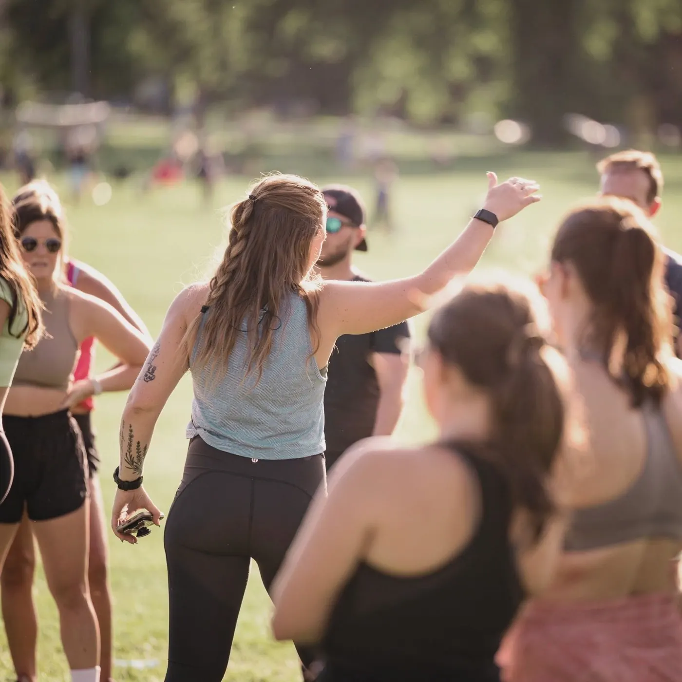
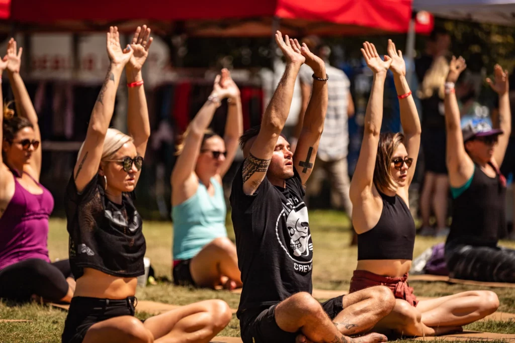
A group gathered on a park lawn, one woman waving the crew in
together
Square post1080 x 1080The headline ends in the pin; the script word and the tilted tower are this post’s own play.
STRENGTH IN THE CITY badge logo

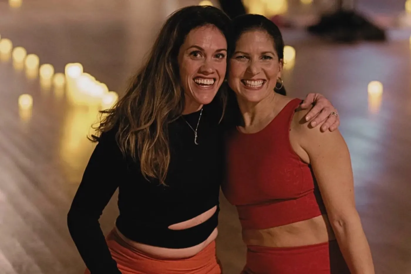
Come on your own or bring a friend

Two friends hugging at an evening event
Date to come

Either way, you won't move alone.

FlyerUS LetterThe badge logo and a headline ending in the pin; the photo crop and the rings are this flyer’s own choice.

STRNGTH.

The brightest look in the family, known by its name lettering and its seven colors. The festival page and the two pieces below show one way to build it: a Kraft paper collage with black and white cutouts and paint in the seven colors. A clean editorial series on a cream or charcoal ground, with Poppins capitals, a red script word, one idea per piece (a receipt, a vinyl record, a bingo card) and the seven colors as a small stripe, is another way.

SRed #C62A27 TTeal #00968F RYellow #E4BE22 NPink #FF48B0 GCobalt #2F4FC0 TOrange #FF6C2F HOlive #7E9424 Kraft #F0E9DC
The seven STRNGTH. colors, one per letter, in this order. Every STRNGTH. piece shows them, even as a small touch: a stripe, the letters, an accent.Where each color goes: the Complete Brand Book, Color.
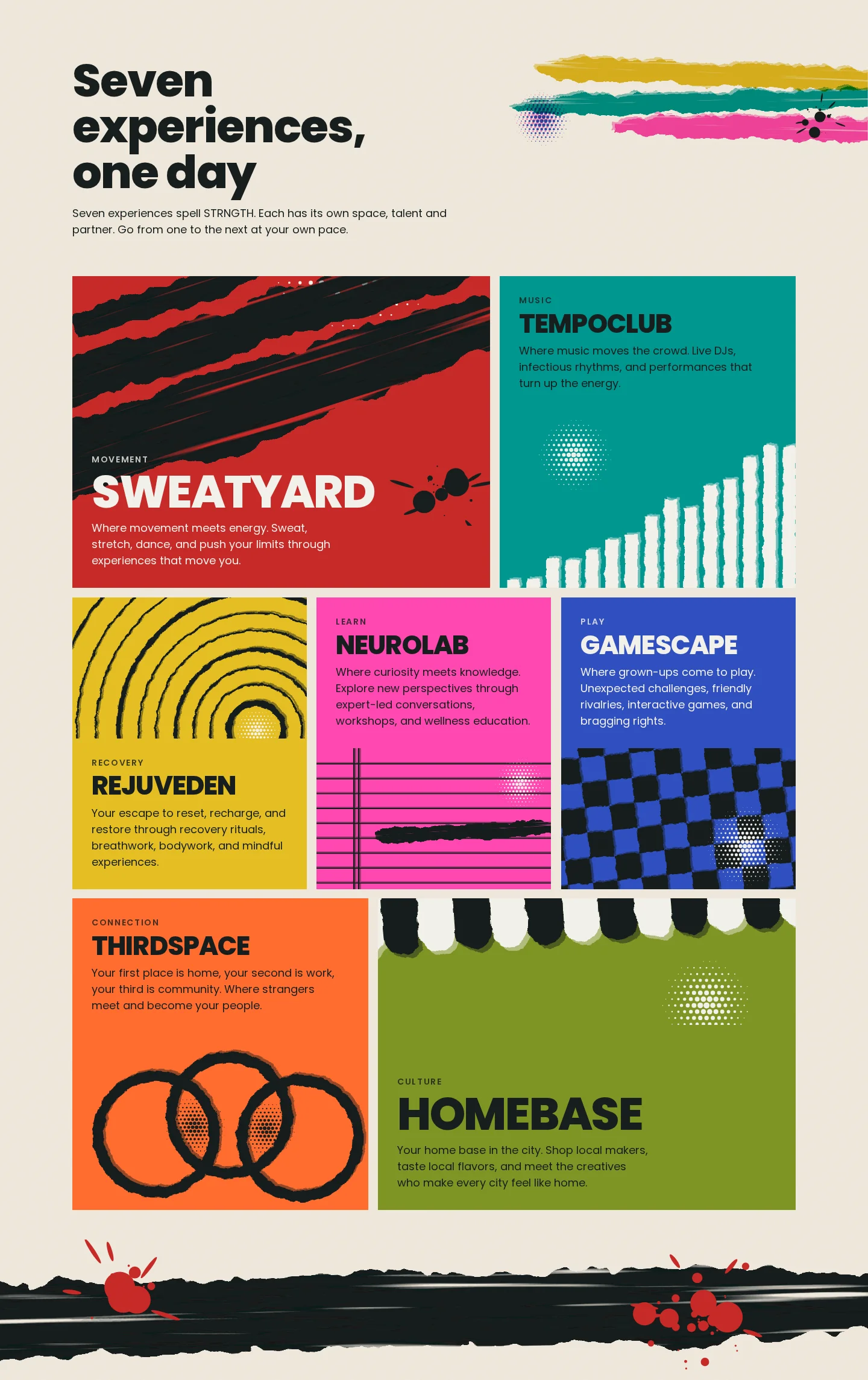
Screenshot of the STRNGTH. festival page at 1440 wide: Seven experiences, one day, with seven torn paper tiles, one per color: SWEATYARD, TEMPOCLUB, REJUVEDEN, NEUROLAB, GAMESCAPE, THIRDSPACE and HOMEBASEScreenshot of the same section on a phone, 390 wide
Web page: the seven experiencesscreenshot of the live site, 1440 wide, phone 390Here each experience gets its own color tile with torn paper art, in STRNGTH. letter order.
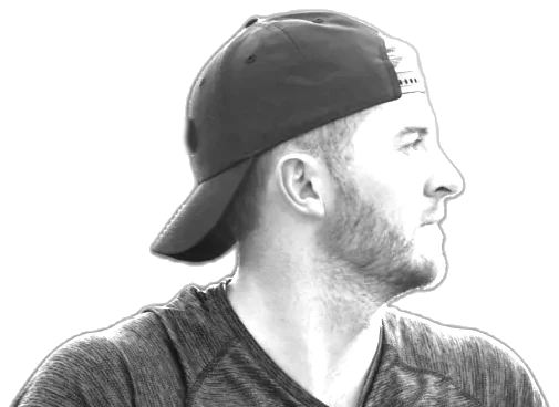
A man in a cap in profile, cut out around his head and shoulders in black and white STRNGTH St. Louis 2027
WELLNESS
FESTIVAL
THE ONE DAY MY WHOLE CITY MOVES TOGETHER.
Date to come
MOVEMENT.RESET.CONNECTION CLUB.
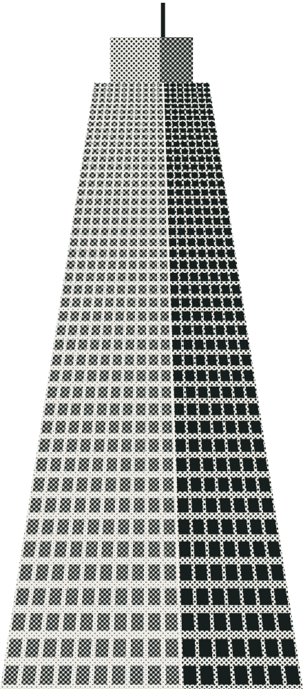
St. Louis poster18 x 24 inOne way to tell a city apart: on this poster St. Louis’s own things, the Arch, the skyline on the river, a bat and ball, grow out of the head.
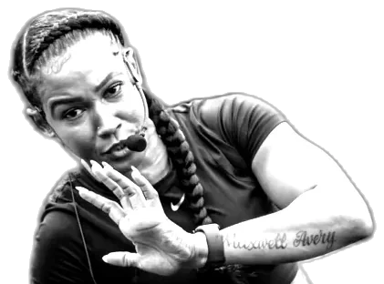
An instructor with a headset mic reaching out, cut out around her head and shoulders in black and white oneSTRNGTH Chicago 2027
THE CHICAGO
WEEK.
Sept 9 to 13
MOVEMENT.RESET.CONNECTION CLUB.
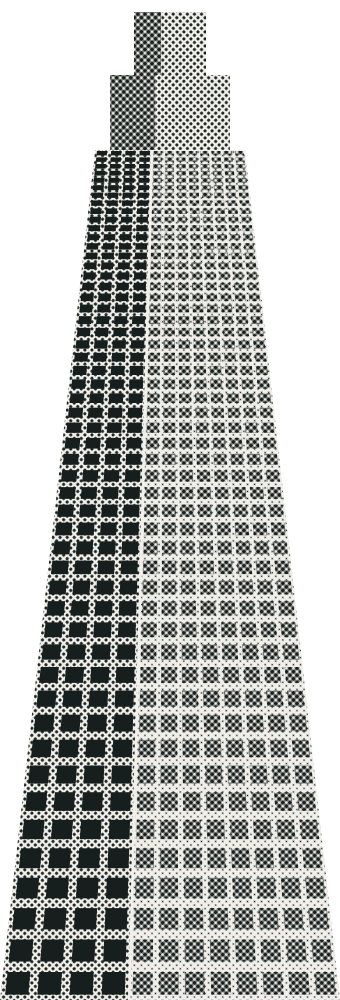
oneSTRNGTH. Chicago post1080 x 1350In Chicago the name is oneSTRNGTH. This post grows the skyline, the L and the lake out of the head.

STRENGTH Collective

Chic, premium, credible. Warm and calm, for pros who come to learn. These pieces show one way: big photos in soft daylight, short serif headlines and numbered sections.
Cream #FAF6F0 Sand #E2D7C8 Taupe #B9A795 Mocha #6B4F3A Brown #3B1F07
Noto Serif Display for headlines and numbers; Elsie Black for series namesPoppins for text, Cognito Scripto for script words
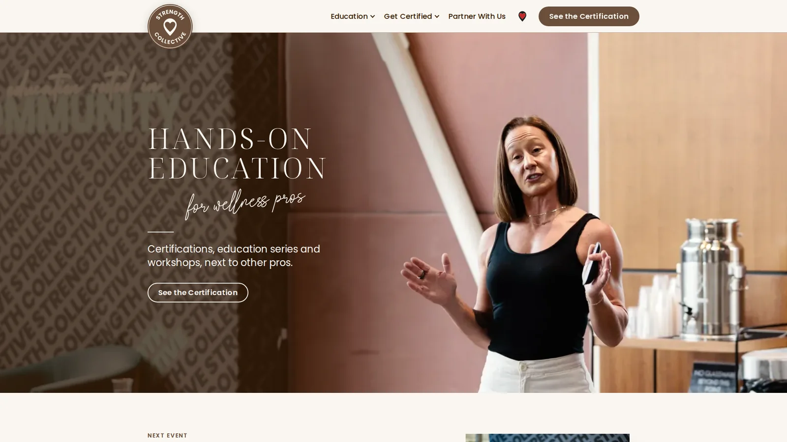
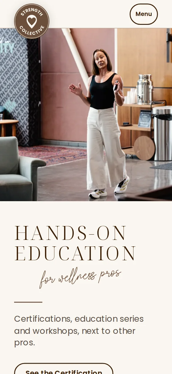
Screenshot of the STRENGTH Collective page, first screen at 1920 wide: a pro teaching the room, the words HANDS-ON EDUCATION for wellness pros on the quiet side of the photoScreenshot of the same first screen on a phone, 390 wide: the photo on top, the words under it
Web bannerscreenshot of the live site, 1920 x 1080, phone 390Here the pro is the hero of the photo and the words sit on its quiet side.
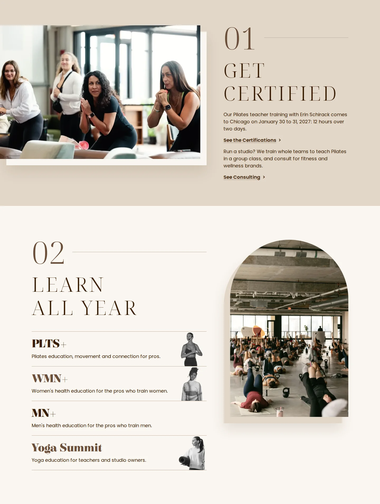
Screenshot of two STRENGTH Collective page sections at 1440 wide: 01 Get certified, photo left, and 02 Learn all year, photo right in the archScreenshot of the same two sections on a phone, 390 wide
Page sectionsscreenshot of the live site, 1440 wide, phone 390This page numbers its sections and swaps photo and text sides row by row.
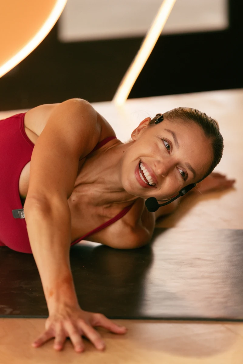
A Pilates teacher smiling on her mat, cueing the class through a headset
STRENGTHCollective
PLTS+
collective Education series
PLTS+ series post1080 x 1080The PLTS+ series name with a script word; this post sets the photo on a Sand block.
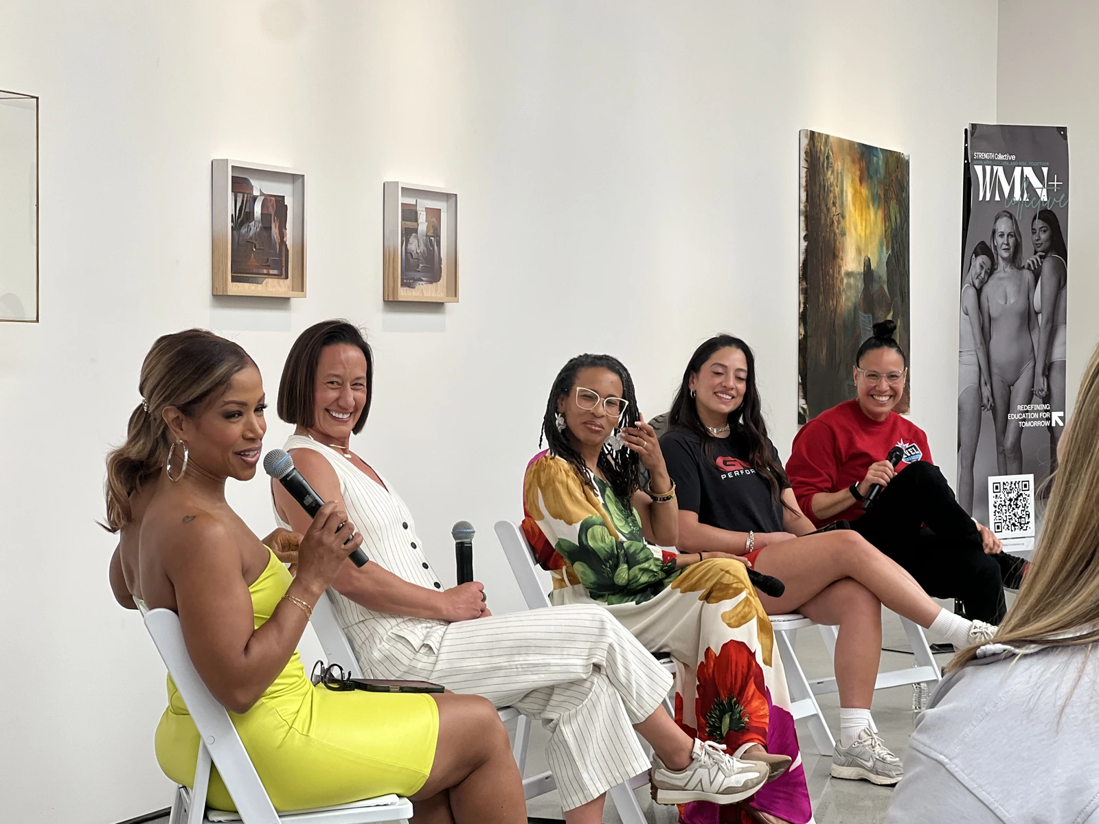
Women pros on a panel at a WMN+ event, talking to the room
STRENGTHCollective
WMN+
collective
WMN+ series post1080 x 1080This post frames the photo in an arch.
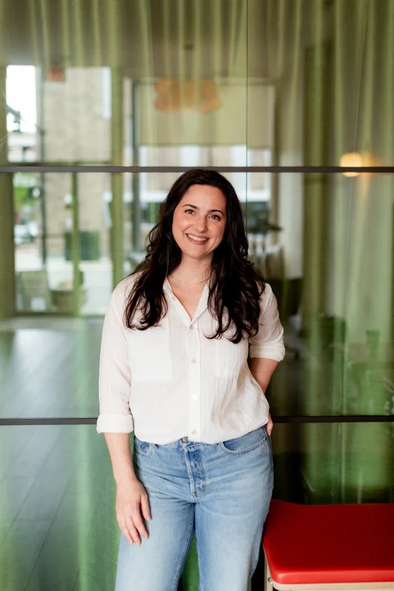
A pro standing in soft daylight by a green curtain, smiling
STRENGTHCollective Education

LEARN IT
HANDS-ON

for wellness pros
Square post1080 x 1080A short serif headline with a script line crossing it, over a photo in soft daylight.

Rebels for a Cause

A black tie charity fight night. Here warm ink, ivory and cream carry the prestige, Rebels red the action, with near black and white photos. La Femme uses the same look.
Ink #141210 Ivory #F1EBDF Rebels red #C62A27 Paper #EFE8DA
Archivo for headlines and text, Instrument Serif italic for a flourish
The Rebels for a Cause badge
Into the ringfor a causeThe Rebels for a Cause 2027 nameSTRENGTHIN THE CITY
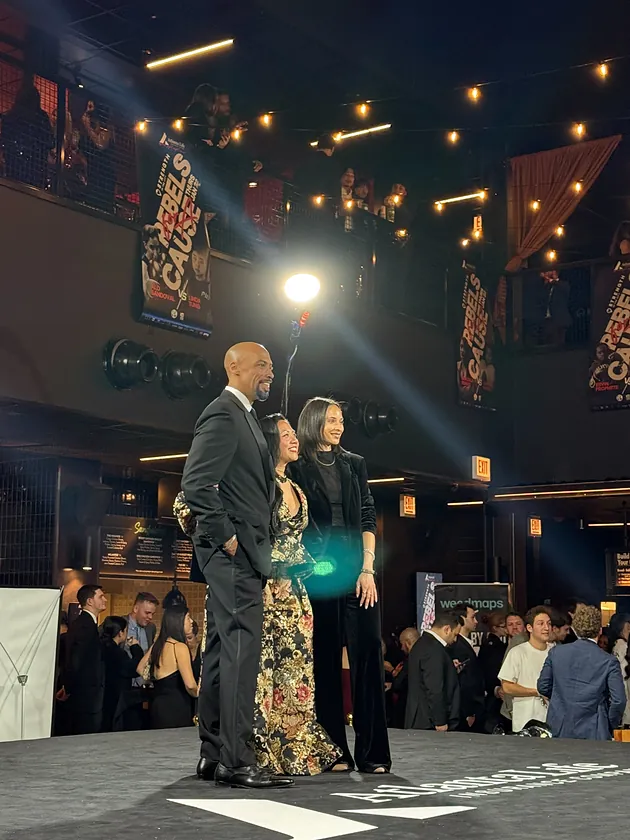
People in black tie at the fight night
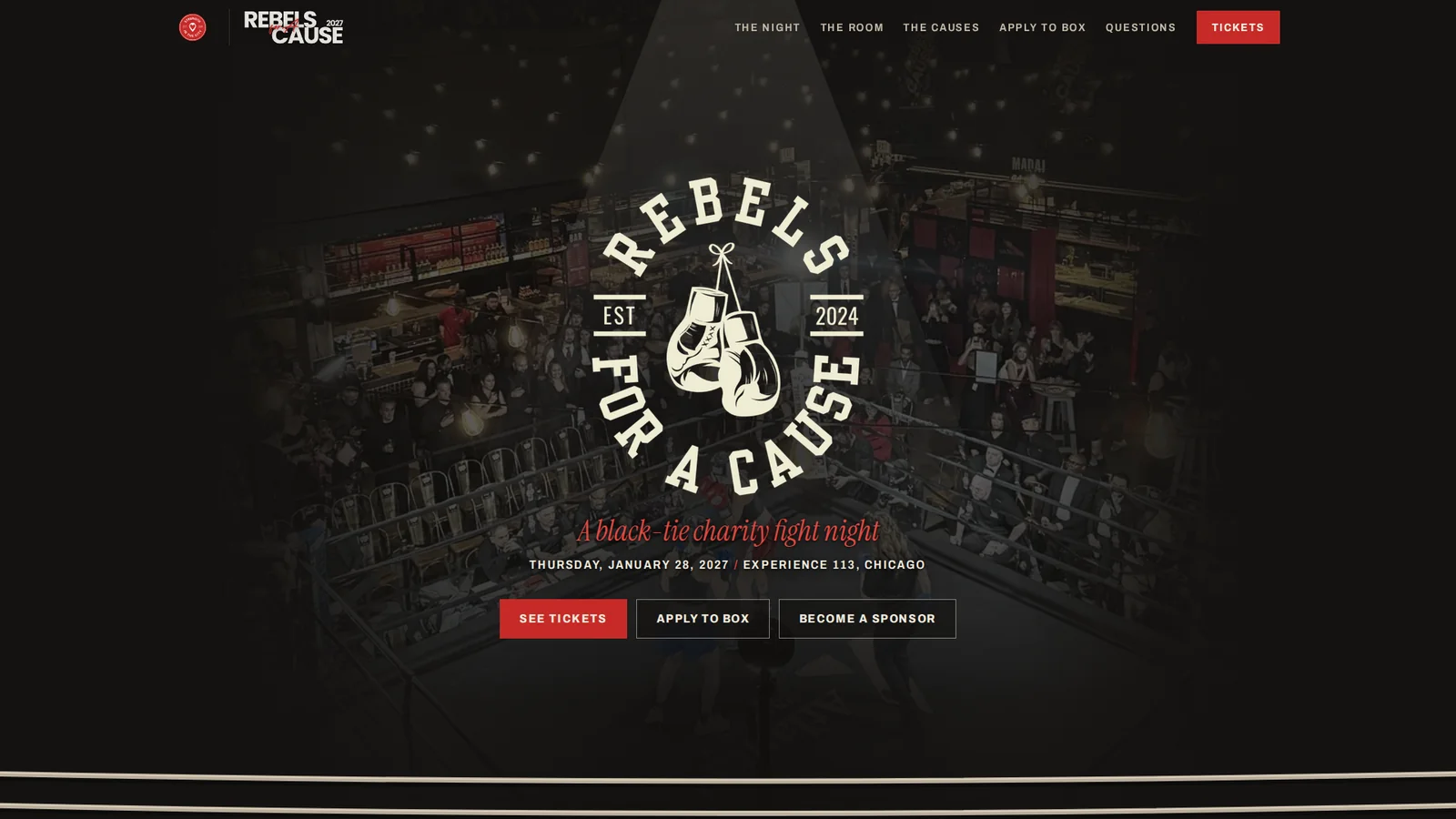
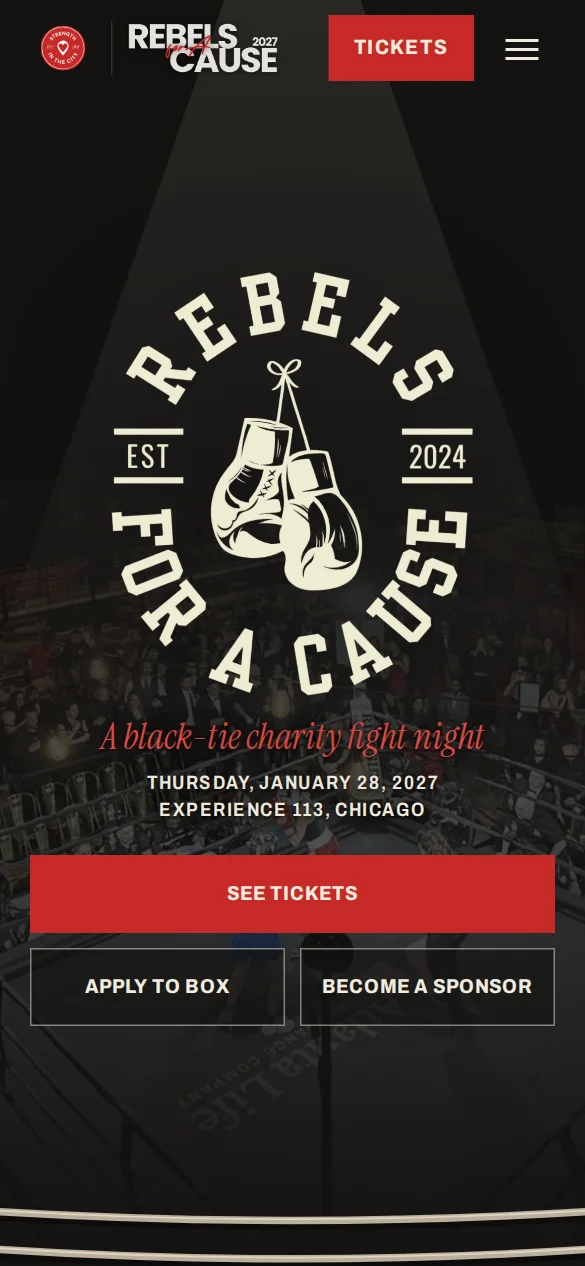
Screenshot of the Rebels for a Cause page, first screen at 1920 wide: the round Rebels badge under a spotlight over the ring and crowd, A black-tie charity fight night in red script, and three buttonsScreenshot of the same first screen on a phone, 390 wide
Web bannerscreenshot of the live site, 1920 x 1080, phone 390Here the badge sits in a spotlight over a near black photo of the ring, with one red line in script.

STRENGTH Showdown

A team contest with a crowd on every side, in the main look. It shares the race day world with STRENGTH Classic; these pieces use a scoreboard, two teams side by side, as their idea.
Red #C62A27 Black #171F1E White #F2F0EA Warm grey #E4E2DD
Poppins: the name lettering in ExtraBold and Regular, the numbers in ExtraBoldSeaweed Script for script words
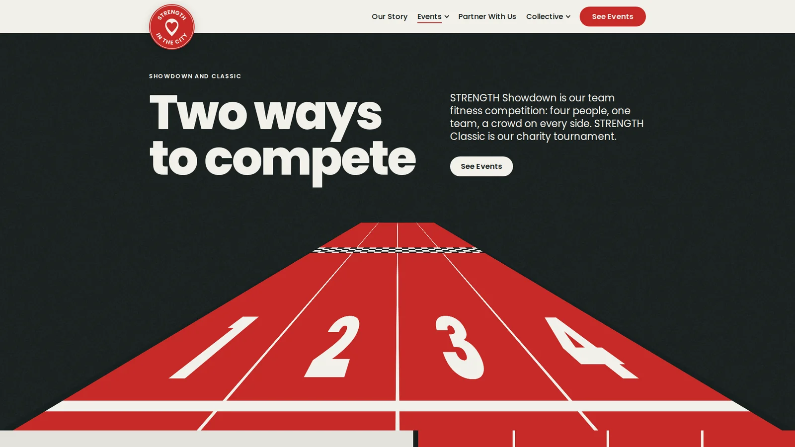
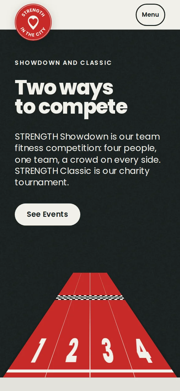
Screenshot of the Showdown and Classic page, first screen at 1920 wide: the headline Two ways to compete over a red running track with lanes 1 to 4Screenshot of the same first screen on a phone, 390 wide
Web bannerscreenshot of the live site, 1920 x 1080, phone 390Here a red race track with numbered lanes carries the contest idea under a big headline.
A crowd with their arms up at an outdoor event
STRENGTHShowdown City · Date to come
Team 1Team 20000VS teamwork
Square post1080 x 1080One way: a scoreboard with two sides and a thin red rule, and the script word teamwork.
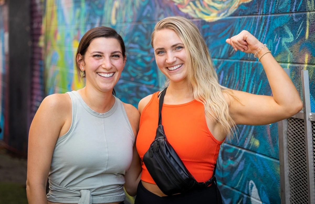
Two women at an event, one flexing her arm, both laughing
STRENGTHShowdown City · Date to come
Team 1Team 20000VS
Story1080 x 1920The same parts as the square post, on a story.